|
Allegro CL version 10.1 |
This chapter contains the following sections:
2.1 Opening Allegro CL
2.2 The startup sequence
2.3 The startup dialog
2.4 After startup
2.4.1 The startup configuration
2.5 Putting components on a form
2.6 Modifying components on a form
2.7 Testing a form by running it
2.8 Specifying event handler behavior
2.9 Projects
2.10 Saving files
2.11 Getting help
This is chapter 2 of the User Guide for the Allegro CL 10.1 Integrated Development Environment (IDE).
The chapters of the IDE User Guide are:
Chapter 1: Introduction to the IDE
Chapter 2: The Allegro CL Development Environment (IDE) (this chapter)
Chapter 3: An example
Chapter 4: Projects
Chapter 5: Components
Chapter 6: Designing a user interface using forms
Chapter 7: Menus
Chapter 8: Events
Start Allegro CL with the IDE by choosing an appropriate item from the Allegro CL 10.1 menu item on the Start menu. The choices that start the IDE include:
If you do start Allegro CL without the IDE, you can start the IDE by evaluating the following two forms. The first loads IDE fasl files and the second starts it up (this is not supported on Allegro Express on Linux):
(require :ide)
(ide:start-ide)
When start-ide is called, it performs the following steps. (This is an abbreviated list providing highlights only. See About IDE Startup in doc/cgide.htm for a complete description of IDE startup.)
-batch),
start-ide exits immediately returning nil.
(The IDE is an interactive interface and it does not make sense to run it in batch –
non-interactive – mode.)After the initialization functions are called, the startup-dialog is displayed (unless it has been disabled).
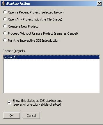
When you start the IDE in Allegro CL 10.1, you are shown the startup-dialog asking about projects: whether you want an existing project opened or a new project created or do not want a project opened by default. The first time the Allegro CL 10.1 IDE is started, the dialog looks like this:
The first choice is Open a Recent Project, which lists projects known to the system. This choice will be unavailable if there are no such projects.
You can arrange to have this dialog suppressed (with, for example, the check box near the bottom). If this dialog is not displayed, the IDE is started with no current project. You can at any time create a new project or open an existing one with File | New Project or File | Open Project.
If you choose Create a New Project (the third radio button down), you are asked to specify a project directory, where project files will be located. The very first time you do this, the Project Parent Directory dialog is displayed, allowing you to choose the parent directory for project directories. The default for the project parent directory is C:\allegro-projects. After the project parent directory is specified (it applied to all projects), then creating a new project causes this dialog to appear, asking for the project directory for the new project:
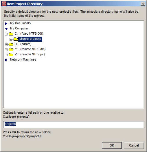
You can accept the default or specify a different directory. The project parent directory is stored in the allegro-ide-options.cl file in your home directory (on UNIX) or personal documents directory (on Windows). Sometimes it is located in the Allegro directory (where Allegro CL was installed) depending on certain options. Wherever it is, if you delete that file, the next time you create a new project, you will be asked to specify a project parent directory first.
The figure shows the Allegro CL start-up state (slightly rearranged to make the pieces more visible). This is the state when a new project is created on startup. Note that there are numerous ways to customize what is displayed on startup (see the dialog). However, the windows shown here and those listed but not shown are most of the important windows in the IDE. You can display a particular window with the View menu.
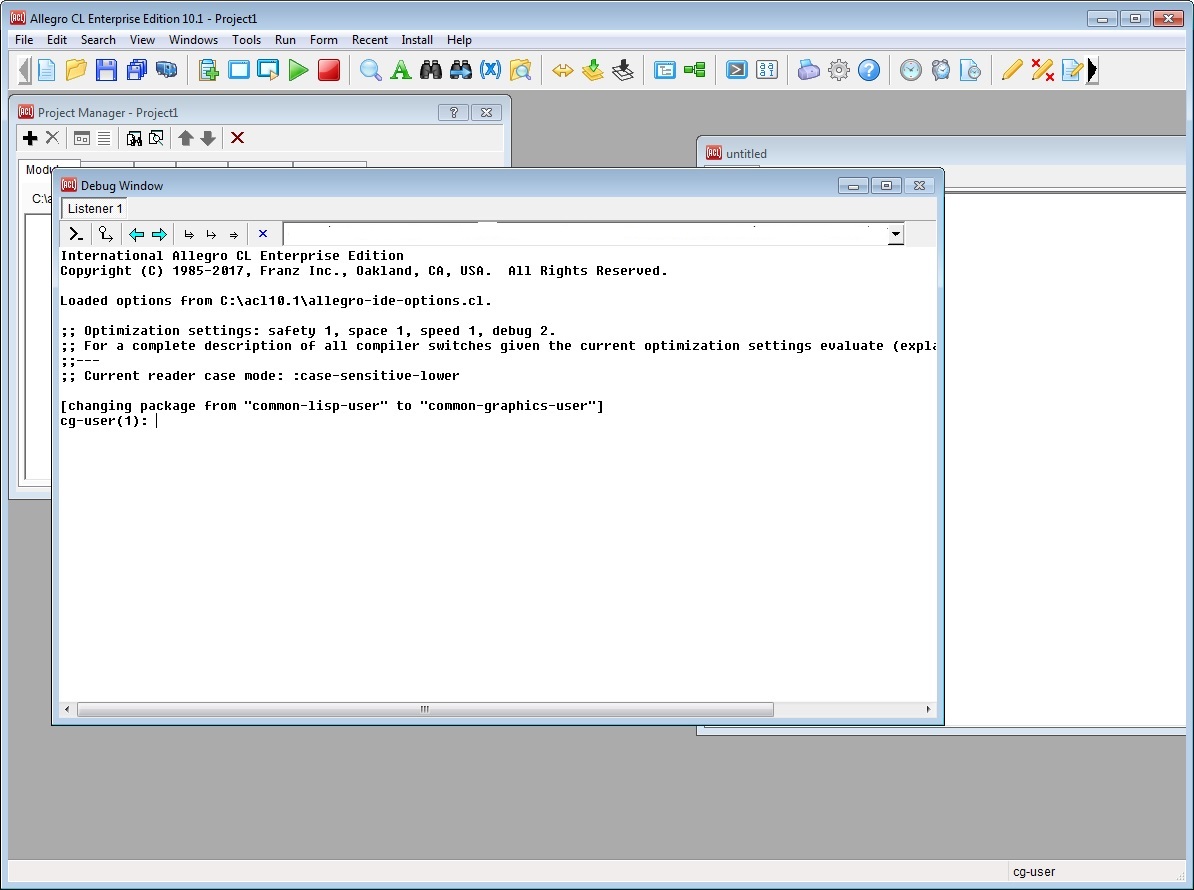
At the top of the screen is:
The Project window. The project window has the menu bar and a toolbar. The toolbar has buttons grouped in associated sets, first standard file operations such as Open, New, Load, and Save, and then groups for running forms and projects, for inspecting Lisp objects or searching source code, and so on. In earlier versions, components were displayed on the toolbar but components have been moved to their own floating palette, displayed with Form | Show Widget Palette. The widget palette is shown here:
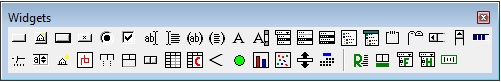
The buttons on the palette correspond to available components that can be placed on forms while designing the user interface to your application.
We have started the IDE with the option Use Single IDE Parent Window specified true (as it is initially). There is an opaque background to the IDE on which all IDE windows and dialogs are diplayed. The status bar, which displays useful information such as operator argument lists and current status, is at the bottom of this background window. If we turn that option off (as can be done on the IDE1 tab of the Options dialog displayed with Tools | Options):
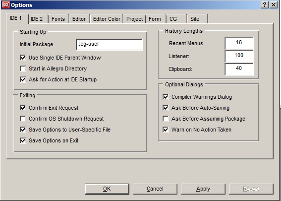
The IDE will look like this (after it is restarted -- that option cannot be changed in a running Lisp; the yellow is the Windows background color):

Now the status bar is on the bottom of the Project window. The current package (common-graphics-user, nickname cg-user) is displayed to the right of the status bar. See the note below if you want more items on the toolbar.
Below the Project Window is the Debug Window. Other Windows are displayed with the View menu.
The debug window is a Lisp listener with a prompt and can be used to evaluate Lisp expressions (useful to check the values of variables and to test functions, among other things). If there is an error, a backtrace and information about the error are displayed in this window (unless the backtrace is too big, in which case it is displayed in a separate window).
Not visible in that illustration (because we started without a project open) are:
The Project Manager. The Project Manager dialog displays information about the current project. You can use this dialog to modify aspects of projects (add files, delete files, etc.)
The Inspector. The inspector displays properties, events and internals of the currently selected object, When viewing the properties tab of the inspector, the property names are on the left and values are displayed on the right. A value can be set directly in the Inspector Window, with the new value having an immediate effect on the object being designed. Display an inspector with the View menu. Certain gestures (such as double-clicking over a form) display the inspector inspecting the object clicked over.
A blank form. A form is a design tool for designing the windows (of all types) that may appear when your application is run. Each form corresponds to a window in the application. You can add components to forms and then customize their display and behavior according to the needs of your application. (You must have a project open to display a form so we have opened a new project with File | New Project. The Project Manager and an editor workbook are displayed when we do this.)
Get a new form by choosing New Form on the File menu. The New Form dialog appears asking you to choose the class of the new form:
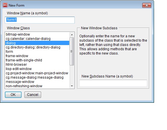
We accept the default, which is dialog. The new form appears and is automatically added to the current project.
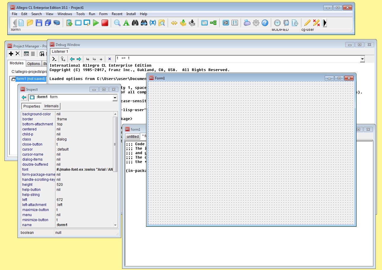
Along with the new form, named form1, an inspector window inspecting the form is opened. And an editor buffer named form1 has been opened and form1 is listed as a module in the project (look at the visible bit of the Project Manager).
The set of commands that are included on the Standard Toolbar may be customized. To do this, first expose the Extended Toolbar via the View | Extended Toolbar command. Then hold down the ALT key, left-click down on an icon in either the Standard Toolbar or the Extended Toolbar, drag it (while continuing to hold the mouse button down), and then release the mouse button to drop the icon on the other toolbar (or at another location on the same toolbar).
If not all of the icons fit into the current area of the Standard Toolbar, then its scroll buttons will be turned on and you won't see all of the commands at once; to remedy this, invoke the View | Toolbars command twice to toggle the Standard Toolbar off and back on --- this will adjust the size of the Standard Toolbar to fit all of its icons without scrolling. The new set of icons will be saved in the allegro-ide-options.cl file (as the value of the standard-toolbar-icons property) whenever the configuration options are saved (typically at Lisp exit, to be restored in later Lisp sessions). Note that there is no provision to add or remove the vertical separator bars.
The configuration (the arrangement of windows) and various choices options, like the editor mode, are stored in the file &allegro-ide-options.cl. Many of these options may be modified by displaying the Options dialog (click Tools | Options). The allegro-ide-options.cl file is generated automatically when Allegro CL exits (unless Tools | Save Options on Exit is toggled off). You can write the allegro-ide-options.cl file at any time by choosing Tools | Save Options Now. If you want to get the original configuration, remove or rename allegro-ide-options.cl before starting Allegro CL. Note that allegro-ide-options.cls hould not be edited by hand.
Applications typically display one or more windows (including dialogs) when run. These display information to the user and collect input from the user. You design these windows by placing components on a form while you are designing the interface.
Components that you can use while designing in a form are displayed on Widget Palette displayed with Form | Show Widget Palette.
To put a component on a form, click on the button corresponding to the desired component on the toolbar and then click or press the mouse button on the blank form. The component with default size will be placed where you click. Pressing the mouse button anchors one corner of the component on the form. If you release the mouse button at once, the component with default size is placed on the form. If you hold the mouse button down and move the mouse, a rubber band outline shows the proposed exterior of the component. Releasing the button places the component with the specified size and location.
Components on a form can be resized, moved, or deleted at will. As a component is moved, alignment cues appear when it is in alignment with other controls on the form. Components can also be copied by selecting and clicking Edit | Copy. Paste then places them on the same form or on another form (you cannot control the location of the paste but you can move the component as desired after pasting).
When a component is selected on a form, it can be resized as desired using the sizing handles (the little solid squares about the control). You can reposition the component by clicking inside the component but not on a sizing handle and dragging the mouse. Also, when a component has been selected, the Inspector displays information about the component. Many properties in an inspector window can be modified directly, and those modifications show up on the component on the form when the inspector is modified.
You can select more than one component: select one, then click on others while the shift key is down. Each selected component has hollow handles (rather than solid sizing handles). The components cannot be resized as a group but can be moved as a group, and the Inspector shows properties common to all selected components and change likewise affects them all. You can also use rectangular selection to select several components at once. Press the left button away from any component and move the mouse, which causes a rubber band box, anchored where the button was pressed, to be displayed. All components within the box when the button is released will be selected.
When a component is selected on a form, it can be resized or moved with the mouse. In this example, the radio button is selected. Notice the small dark squares surrounding the radio button in the illustration. They are sizing handles. When the cursor moves over one of the solid sizing handles, it changes to one of the standard resizing cursors. If you click when the cursor is one of the resizing cursors, then you can resize the component.

As a component is moved or resized, alignment cues appear when appropriate to allow accurate alignment of the component with other components on the form.
Changes other than moving or resizing can be made with the Inspector. When a component is selected, the Inspector displays information about the component. Here is the Inspector inspecting the radio button control from the illustration above:
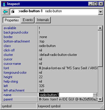
The object being inspected is identified by name in the box just below the title (:radio-button-1 in the illustration). The box is a combo-box and previously inspected objects are shown in its drop-down menu. Choosing one changes the inspection to that object. Clicking the button to the left inspects the object inspected just before the current object. The buttons below, labeled Properties, Events, and Internals (those are the usual buttons for a component; other types of objects have different buttons), allow inspection of different aspects of an object. For a component, the properties mostly affect the appearance; the events name functions to be called when an event (mouse click, e.g.) happens to the component; and internals are features of the component that can be looked at but should not, in general, be changed.
The illustration shows the properties pane. Property names are listed on the left and values on the right. If an editable property value is selected (as name is in the illustration), the value can be changed, either by typing a new value directly or by clicking on the extended editor button to the right of the value slot. The extended editor button illustrated has three dots, indicating a text control will appear allowing input of a new name.
Other extended editors include a font choices dialog, a color choice dialog, the menu
editor, and others. If the values are true and false only, the extended editor button will
toggle between t and nil (button with a check mark, for example,
the available property). If there are only a few values, it will display a list of all
possible values. For example, for the border property the button looks like a down
arrow (not shown in above graphic).
Inappropriate values will not be accepted; for example, only a color or nil are appropriate for background-color and other values will be rejected. Certain properties are read-only and they cannot, of course, be modified.
Clicking on the name side causes the current value to be inspected. If you click over name in the illustration (value :radio-button-1), you see the inspection of that symbol.
It is useful while using a form to design an application window to see what the window will look like and how it will behave when the application is run. Clicking Run | Run Form causes the window associated with the selected form to be created and displayed. Components are active and respond to the mouse. Look at the Window list (click on View | Window List). You will see two windows named form1 (or whatever you have named the selected form). One is the actual form (which you are designing) and the other is a window built from your design. (The running window exactly covers the design form so the fact that there are two windows is not immediately noticeable.) Clicking Run | Stop closes the running window (as you see if you update the Window List) and re-exposes the design form. Note that when we say `form' in this manual, we do not mean the running window corresponding to the form.
Clicking Run | Run Project invokes the Project Init Function in a separate thread. In the default, this function makes and displays the window associated with the main form of the project so only that window is run unless you have changed the Init Function. This does not matter if your project has only one window. If your project has several windows, Run | Run Form can be used to examine a specific window and Run | Run Project to test the application as a whole. (You have presumably either changed the Init Function or made other programmatic changes to cause the other windows to be displayed.)
Events (mouse motions, mouse button clicks, keys pressed on the keyboard, and combinations of those things) are a common way for a user to communicate with an application. When a component is selected on a form, the Inspector window has an Events tab. Displaying this shows the event handlers associated with the component. The value of an event handler is either nil meaning there is no event handler to run or a symbol naming a function. The event handler function is called when the specified event occurs to the component in the running window. There is a simple example illustrating events and handlers at the beginning of chapter 8.
A project is a collection of modules used to build an application. The modules can be of various types, including application source files, forms, libraries (.dll files), and other projects. See chapter 4 Projects for more information on projects, on managing projects, and on the Project Manager window.
Each module is associated with one or more files and taken together with necessary pieces of Allegro CL itself, these files comprise the application. Tools are provided for testing an application and for preparing an application for delivery, again as described in chapter 4.
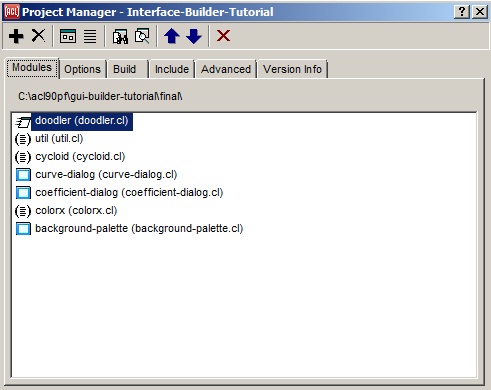
The Project Manager dialog, displayed by clicking View | Project Manager, is a visual display of the current state of a project, showing the modules associated with it, and the name and certain other options of the project. You can use the Project Manager to assist in managing the project and in testing and building the application associated with the project. This is the project manager for the final doodler project created by the doodler tutorial.
When you are editing a file in the Editor, clicking File | Save (or using the Save toolbar button) saves the file to disk, prompting you if necessary for a filename. Save also saves the files associated with a form when clicked while a form is selected. Save All saves all editors with unsaved changes, all forms with unsaved changes and the project file if necessary. (When the Project Manager has focus, Save saves the project (.lpr) file.)
There is online help. In many cases, pressing the F1 key displays help for the currently-selected symbol. If no appropriate page can be determined, a dialog is displayed saying that. A dialog is also displayed if the currently-selected symbol names more than one kind of object (a class and a function, for example). Help | Help on Selected Symbol is the same as pressing F1. When a dialog has focus, Help | Help on Selected Dialog displays the help page for the dialog if there is one.
Help | Tree of Knowledge displays an outline of the Common Graphics/IDE documentation with links to the various pages and files.
Other sources for help:
Go to chapter 3. Go to the beginning of this chapter.
Copyright (c) 1998-2017, Franz Inc. Berkeley, CA., USA. All rights reserved.
Documentation for Allegro CL version 10.1.
Created 2017.2.27.
|
Allegro CL version 10.1 |