|
Allegro CL version 10.1 |
This chapter contains the following sections:
6.1 How to add forms to a project
6.2 Form devices
6.3 Specifying the main form of a project
6.4 Form properties that affect appearance
6.5 Components and forms
6.5.1 Placing a new component on a form
6.5.2 Placing a copy of an existing component on a form
6.5.3 Positioning and sizing a component on a form
6.5.4 Aligning components
6.5.5 Selecting more than one component
6.5.6 Component position when a form is resized
6.6 Setting component properties at runtime
6.7 Modal dialogs
This is chapter 6 of the User Guide for the Allegro CL 10.1 Integrated Development Environment (IDE).
The chapters of the IDE User Guide are:
Chapter 1: Introduction to the IDE
Chapter 2: The Allegro CL Development Environment (IDE)
Chapter 3: An example
Chapter 4: Projects
Chapter 5: Components
Chapter 6: Designing a user interface using forms (this chapter)
Chapter 7: Menus
Chapter 8: Events
The Allegro CL Integrated Development Environment facilitates designing and creating a user interface for your application. The form is the canvas for designing windows. Typically, each project has one or more forms, one identified as the main form and the others (if any) subsidiary forms. Each form corresponds to a window in the actual application. The various windows you see in an application – the primary window (the closing of which ends the application), other windows and dialogs all start as forms in the design process.
In this chapter, we describe how to:
Allegro CL starts with one blank form as part of a default project. The General tab of the project manager (displayed with View | Project Manager) shows all modules (a module may have one or more files associated with it) associated with a project. Form modules have two or three associated files: one .cl (source) file, one .bil file, and (if there are pixmaps associated with the form,) one .bml file. All have the same name but different extensions. The Project Manager shows the form name and the location of the form source (.cl) file if it is saved.
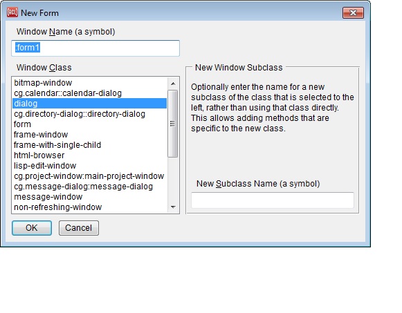
You can add a new, blank form to the current project by clicking File | New Form (i.e. click New Form on the File menu). You are asked what sort of window to design with a dialog similar to:
We describe the choices just below. It is often useful to subclass the classes provided: then you can write methods specifc to the new window (and others of the same subclass), methods that do not modify the behavior of existing windows. You can specify a new subclass in the area to the right. This class will be created and the new form will have it as the value of the class property (accessed by the device generic function).
A common choice is dialog. The different choices are called classes (or, in older documentation devices) and name classes of windows (as described in the next section). Once you choose the class, a new (and unsaved) blank form is displayed, named formn where n is an integer not already used (thus form2, form3, etc.) This new form is automatically added to the current project and will appear at the end of the modules listed in the Project Manager General tab.
You can add an existing form to the current project by clicking on the + button of the Project Manager toolbar and identifying the form source (.cl) file to the Open dialog that is displayed. (The .bil and, if there is one, .bml files must be in the same folder.)
As said in the previous section, when you click File | New Form, a dialog like the following is displayed:
The choices shown identify the class property of the form (meaning the class of the application window created from the form). Note that the accessor of the class property is device (since class is a Common Lisp symbol and should not be overloaded with a function definition). If you define a new class (by subclassing the appropriate window class), it will be displayed in the dialog as well, as the following example shows. Define a subclass of dialog by entering my-dialog in the type-in widget on the New Form dialog, or by evaluating a form like the following in a listener:
(defclass my-dialog (dialog) ())
Click File | New Form and the class choices now include my-dialog (which we have selected):

As we said above, subclassing predefined classes of windows is highly recommended. You can modify your subclasses – changing the initial property values, redefining methods, and so on – without worrying about affecting anything else. Change an existing class and many things may break.
There are many initial device choices. Among the more important are are frame-window, non-refreshing-window, rich-edit-dialog, dialog, text-edit-window, lisp-edit-window, and bitmap-window. The usual choice, if you intend to add components to the form, is dialog, because it is the choice most suitable for components since it supports ALT-key shortcuts and allows you to move keyboard focus among its controls with the TAB key. We describe each type and follow the description with definitions of some terms we use.
Note on windows with subwindows
. The classes that have subwindows (non-refreshing-window, bitmap-window, and text-edit-window) instantiate a frame window plus a pane window inside the frame (retrievable by calling frame-child on the frame). This is not absolutely necessary since you could just draw in the frame-window by itself, but it comes in handy when you want to add a toolbar or status-bar to the window. When added to the frame, these special panes become siblings of the main pane so that the main pane will be an independently scrolling area and the size of it is the actual available drawing size and so on.When you subclass a class of a window with a pane, you should subclass the pane class as well and provide a default-pane-class method so the correct pane will be instantiated when the window is instantiated. Thus, if you subclass text-edit-window, you must (1) subclass text-edit-pane as well and (2) make your subclass of text-edit-pane the default-pane-class of your subclass of text-edit-window (by providing a default-pane-class method).
Here are definitions of some of the terms we just used:
: a backing store is a copy of the contents of a window which is automatically displayed when any portion of the window is exposed after being hidden (covered by another window or because the window was shrunk). Only bitmap-windows have a backing store. (The text in text-edit-panes is redisplayed when the pane is exposed but by a means other than using a backing store.) Note that a backing store is expensive in its use of machine resources.Backing store
: when a window has a pane, it is actually two windows, a frame with the title and border (and perhaps other things) and the pane as a child window. The pane's advantage is that it is automatically resized when its parent is resized or when additional sub-windows, such as toolbars and status bars, are added to the parent. In a frame-window, adding a toolbar (with add-toolbar) covers whatever was at the top and the toolbar can be scrolled out of sight. If a toolbar is added to a non-refreshing-window (or text-edit- or bitmap-windows), the pane is resized (so nothing is covered) and the toolbar is not scrolled.Pane
: the ability to use access keys (pressing Alt and the underlined letter in the title) to change the value of a control or press a button. Access keys for menus on a menubar is supported for all windows.Alt key
: the ability to move focus among controls with the tab key.Tabbing
Because of its ability to have visible components, dialog (or your own subclass of dialog) is the standard choice for a window with visible components. Components on other types of windows should be placed on a toolbar added to the window. Add a toolbar by specifying the toolbar property to be true.
Some examples of window types in the Allegro CL environment: the Project Window in
Allegro CL (with the main menubar and toolbars) is a variety of frame-window; the debug
window is a variety of text-edit-window. If you see a window in the Allegro CL development
environment that you want to emulate, click Tools | Get Component and then click
on the window of interest (clicking on the frame will get the parent window and the
interior will get the pane if there is one). A printed representation of the window object
is written to the debug window. Evaluating (class-of *) tells the class. You
can then look at the superclasses with Tools | Graph
Superclasses (select the class name without the trailing > and click the menu
command). Note that you should not use the classes of Allegro CL windows. Instead, create
your own classes with similar superclasses.
The window corresponding to the main form of a project has the feature that closing that window (by, e.g. clicking on the close button in the upper right) closes the application as well. Main forms are displayed with a different icon than other form modules when you view the General tab.

Form1 is the main form. Its icon looks like it is moving while the icon for form2 looks stable.
The options tab of the Project Manager window displays the forms associated with a project (this is from the Interface Builder Tutorial project):

The main form is identified – doodler in the illustration. The other forms are displayed in the drop-down list. To select a different form, display the list and select a different form. The Init Function, in the default is make-<main-form> but the default name is not listed. This function creates and displays the window associated with the main form so if you use the default init function, when your application is started, the window associated with the main form is displayed and it is the only window displayed initially. Other windows must be displayed programatically.
Forms are components and have properties. You can inspect the properties of a form by selecting the form. The illustration shows the properties of a form:

All the properties are described on their online manual pages. Here we just mention two:
:none, then
the corresponding window cannot be resized with the mouse and there are no close or
minimize buttons. nil,
no title bar displayed and (as a result) no close or minimize buttons. Form design is somewhat WYSIWYG (what you see is what you get), i.e. it looks quite like its associated window, but a form always has a title bar, an active close box and minimize button, and a border, and are always resizable while the associated window may not have those features. These features are provided for forms to make them easy to design. Further, the attachment properties of the components on a form (how the component moves or resizes when the parent window is resized, e.g. right-attachment and left-attachment) are mostly disabled. Components keep constant distance from the top and left of the form and are never resized as the form is resized even though that might not be their behavior (depending on their attachment properties) when the window associated with the form is resized. Again, this is a feature to assist in form design.
Run the form (click Run | Run Project or Run | Run Form to see how the associated window will behave in the application). Run Project runs the project's init function (which in the default displays the main form only). Run Form displays the selected form regardless of whether it is the main form. Also Run Project runs the project in a separate thread (so you see an item for it in the task bar) while Run Form runs the form in the IDE GUI thread.
Much of the time spent designing the user interface to your application is spent manipulating components in forms. Chapter 5 on components describes the type of components, which are suitable for what purposes, and how the behavior of a component can be customized. Here we discuss issues relating to positioning components on the form, associating separate components with each other and tabbing between components, issues dealing with components on forms rather than individual component behavior.
Click on a component button on the component toolbar. The button stays pressed until you add the component to a form. Then clicking and releasing on the form (at the location you want the upper left corner of the bounding box of the component to appear) places the component with default size at that location. Clicking without releasing and dragging the mouse positions the component with one corner at the click location and the other corners specified by the rubber band box that appears as you drag. This allows components to be sized when placed if desired. (Components can be resized at any time by selecting and then dragging over the sizing handles that surround a selected component.) The new component object will have default properties.
Selecting an existing component, clicking Edit | Copy, and then Edit | Paste causes a new instance of the selected component (with all properties except name identical) to be placed on the form. The new copy is placed close (offset down and to the right) to the existing one (assuming they are on the same form). Move it to the desired location using the mouse.
Note that copying works between forms as well: if you copy a component from form1 and then select form2, clicking Edit | Paste will place the copy on form2. Using the same component instance (rather than copies) more than once is not supported.
Edit | Cut deletes the component and puts the component object on the clipboard. Edit | Paste places it on the selected form. Selecting a component and pressing the Delete key deletes the component.
When a component on a form has focus, sizing handles appear around it: If sizing handles are solid, then you can use a handle to resize the component.

As the cursor moves over the sizing handles, it changes to a vertical (top and bottom handles), horizontal (right and left handles), or 45 degrees (corner handles) double-headed arrow. Pressing the left mouse button and moving the mouse resizes in the direction of the arrows. You can also change the appropriate property (height, e.g.) of the component in the Inspector window while the component has focus and the size or location of the component on the form changes. Also, pressing the left button while inside the sizing handles and moving the mouse moves the component.
As a component moves into alignment (vertical or horizontal) with another component on a form, an alignment cue appears exactly when the components are aligned. Movement is also temporarily stopped. If you release the mouse button while the alignment cue is visible, the components will be in exact alignment. Thus it is easy to align components exactly as you wish.
Clicking Form | Show Alignment shows all alignment cues for currently aligned components.
Clicking Form | Space Equally while three or more components are selected repositions them so they are spaced equally along the obvious (to the system) axis. This feature is most useful when the selected components are aligned horizontally or vertically.
If you select a component (by clicking over it) and then, while pressing the Shift key, click over a second component, both components will be selected. (And additional components can be added to the selection in the same way – press the shift key and click over the component you want added to the selection.) Resizing is disabled when more than one component is selected but all selected components will move as a unit if the left button is depressed over a selected component and the mouse is moved.
You can select multiple components with rectangular selection. Click on the form but outside of a component, drag the mouse and a selection rectangle appears. Any component that overlaps or is enclosed by the selection rectangle will be selected when the mouse button is released.
When more than one component is selected, the Inspector window shows common properties and events shared by all the selected components. (The title of the Inspector changes to Inspect Multiple. The values for the properties and events are for the last selected component. Changing a property/event changes all selected components.
Attachments are not active during design, because during design you need to specify the form size and component location without one affecting the other.
When a form is resized, the top-left corner of the component maintains the same relative position to the top-left corner of the form’s interior. Component position on a form is determined by the top and left properties (they specify the distance from the top and left edge of the form). While a form is being designed, those values are not affected if the form is resized. Therefore, if the top of a component is 100 (meaning it is 100 pixels below the top of the form) and the form is resized so it is only 50 pixels high, the component will no longer be visible.
Note that this behavior is different from what happens when the window associated with the form is resized. The issue of what should happen to a component when the parent window is resized is complicated: should it be resized proportionally or remain the same size? If it remains the same size, should its location in the resized window be absolutely the same (still 100 pixels down from the top and 30 pixels right of the left border, say) or should they scale in proportion to the resizing (to 50 pixels down if the window height is halved). The behavior is controlled by the various attachment properties – top-, bottom-, left-, and right-attachment. We will not discuss attachment in more detail here (see the online manual pages for attachment properties): we are emphasizing that this is a situation where the behavior of the form and the associated running window are different in that attachments are ignored on forms.
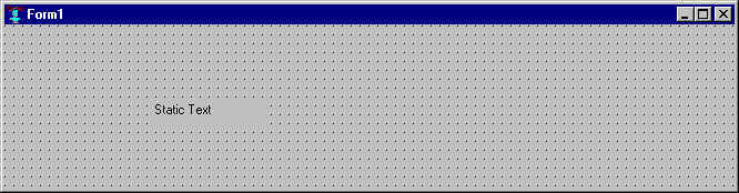
As a consequence, a large resize can cause a component to cease to be visible. This form has three components:
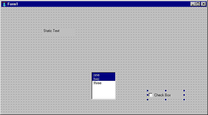
When we make the height much smaller, the check-box and multi-item-list cease to be visible:
They are still there of course. You can enlarge the form, move them up, and shrink it again. You can also see the list of all components by clicking on the dialog-items property (not the value but the property on the left). This causes the Inspector to inspect the value of the dialog-items property:

The first lines describe the value (identifying it as a cons – i.e. a list) whose elements are then listed – the (still visible) static-text, the multi-item-list, and the check-box. Clicking on 1 (on the left) inspects the value of our invisible multi-item-list.

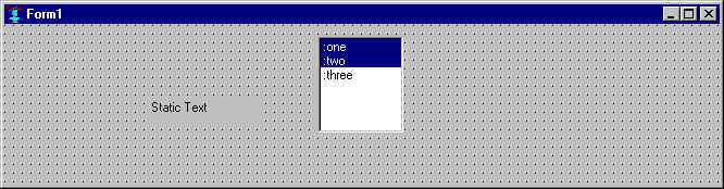
Modify the top property, from the current 232 to, say 10, and the multi-item-list is visible again:
See Chapter 5 for more discussion of component properties and how to set them during the design (but briefly, select the component and its properties and their current values are displayed in the Inspector; click on the value of a property and either type in the new value or click on the button to the right of the value slot to set using a dialog or toggle if true/false). However, you may not want to specify everything at design time since you may want different things to appear depending on information provided at startup or from the environment. For example, suppose you have a window for providing information on how to contact you if your user has a problem with the application.

This window may be part of a standard project used as a subproject for various applications. The message may be the same for each application but the title (foo as displayed) should be the name of your application. If you are using this form for your Destructo application, your Gardening application, and your Thai Cooking application, Destructo, Gardening, and Thai Cooking should be the respective titles. Now, you can either have three different forms, one for each application, or you can have one form whose title property is set at runtime rather than design time. (And having one form means that only one form has to be changed if, for example, you get a new telephone number.)
In the source code for your application, during initialization, an expression such as the following should be executed (for the Destructo application, replace Destructo with Thai Cooking or Gardening for the other applications):
(setf (title (find-window :help-dialog)) "Destructo")
Here :help-dialog is the name (the value of the name property) of the dialog, find-window finds the dialog object (i.e.
the window associated with the form), title
accesses the title property, and setf is the Lisp operator which changes
values of properties.
A dialog is modal if, when it is displayed, only it is receptive to events (mouse or keyboard). Therefore the user must deal with the dialog before doing anything else with the application. For example, the dialog displayed by File | Save As in Allegro CL is modal. You must either specify a file as a location to save whatever is being saved or click cancel.
For a dialog to be modal in an application, the following properties should be set as indicated:
nil. If not, the window will not be displayed outside its owner and may in
fact be hidden, meaning that it cannot be cleared, but neither can anything else be done.nil.
Modal windows typically do not have these features.:shrunk,
so the window is not visible until popped-up with pop-up-modal-dialog.The pop-up property acts as a surrogate for those properties. If you set it to t in the inspector, the other properties will be coerced to the values indicated. Note that the pop-up property does not have additional programmatic effect. Note too that a non-modal window can have the indicated values for these properties as well.
Such dialogs can be displayed in a modal fashion with pop-up-modal-dialog. Every modal dialog should have an obvious way for the user to deal with it since the user can do nothing else until it is dealt with. The Default and Cancel button components are designed for this purpose. Each has an initial on-change handler function, return-t-from-pop-up-dialog and return-nil-from-pop-up-dialog respectively, that closes the dialog and causes pop-up-modal-dialog to return t or nil. After pop-up-modal-dialog returns, the dialog has disappeared from view but it still exists as an object and the values of the components on the dialog can be examined. Options dialogs are often modal (although the Allegro CL Options dialog is not). After the user has clicked the default button (often titled OK or Accept), the program can act on the choices the user made with code like:
(if (pop-up-modal-dialog (find-dialog :options))
    (dolist (i (dialog-items (find-dialog :options))
               (... get the value and act appropriately ...)))
Go to chapter 7. Go to the beginning of this chapter.
Copyright (c) 1998-2017, Franz Inc. Berkeley, CA., USA. All rights reserved.
Documentation for Allegro CL version 10.1.
Created 2017.2.27.
|
Allegro CL version 10.1 |