|
Allegro CL version 10.1 |
This chapter contains the following sections:
3.1 A simple example with two communicating controls
3.2 Building an application
3.3 The Doodler Tutorial
3.3.1 What the doodler application does
3.3.2 Developing an application
3.3.3 The steps in developing the doodler application
3.3.4 The doodler application windows
3.3.5 Popping up a common dialog
This is chapter 3 of the User Guide for the Allegro CL 10.1 Integrated Development Environment (IDE).
The chapters of the IDE User Guide are:
Chapter 1: Introduction to the IDE
Chapter 2: The Allegro CL Development Environment (IDE)
Chapter 3: An example (this chapter)
Chapter 4: Projects
Chapter 5: Components
Chapter 6: Designing a user interface using forms
Chapter 7: Menus
Chapter 8: Events
The problem with examples is that to be interesting, they have to do something interesting (to you, the reader) and anything that does something interesting needs some programming. The Allegro CL IDE is a tool for designing and implementing user interfaces to applications, along with a collection of tools which make the task of programming easier, but it does not write the underlying program (the part that actually does the work, often called the engine).
We will discuss two examples in this chapter. First is a simple example where we make a form with two controls. We modify the event handler of one control so clicking on it prompts the user for a string and then displays the string in the other control. We show all steps and illustrate various windows and dialogs as we go.
Second, we discuss the application created by the Interface Builder Tutorial. We do not discuss the steps of the Tutorial in detail. Rather we discuss aspects of the finished application. If you see a feature of interest to your needs, you know that information on implementing it can be found in the Tutorial.
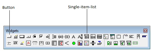
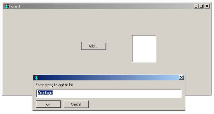
In this example, we create a dialog with a button and single-item-list. We will arrange it so that clicking on the button displays a dialog asking the user to enter some text that is then added to the items in the single-item-list.
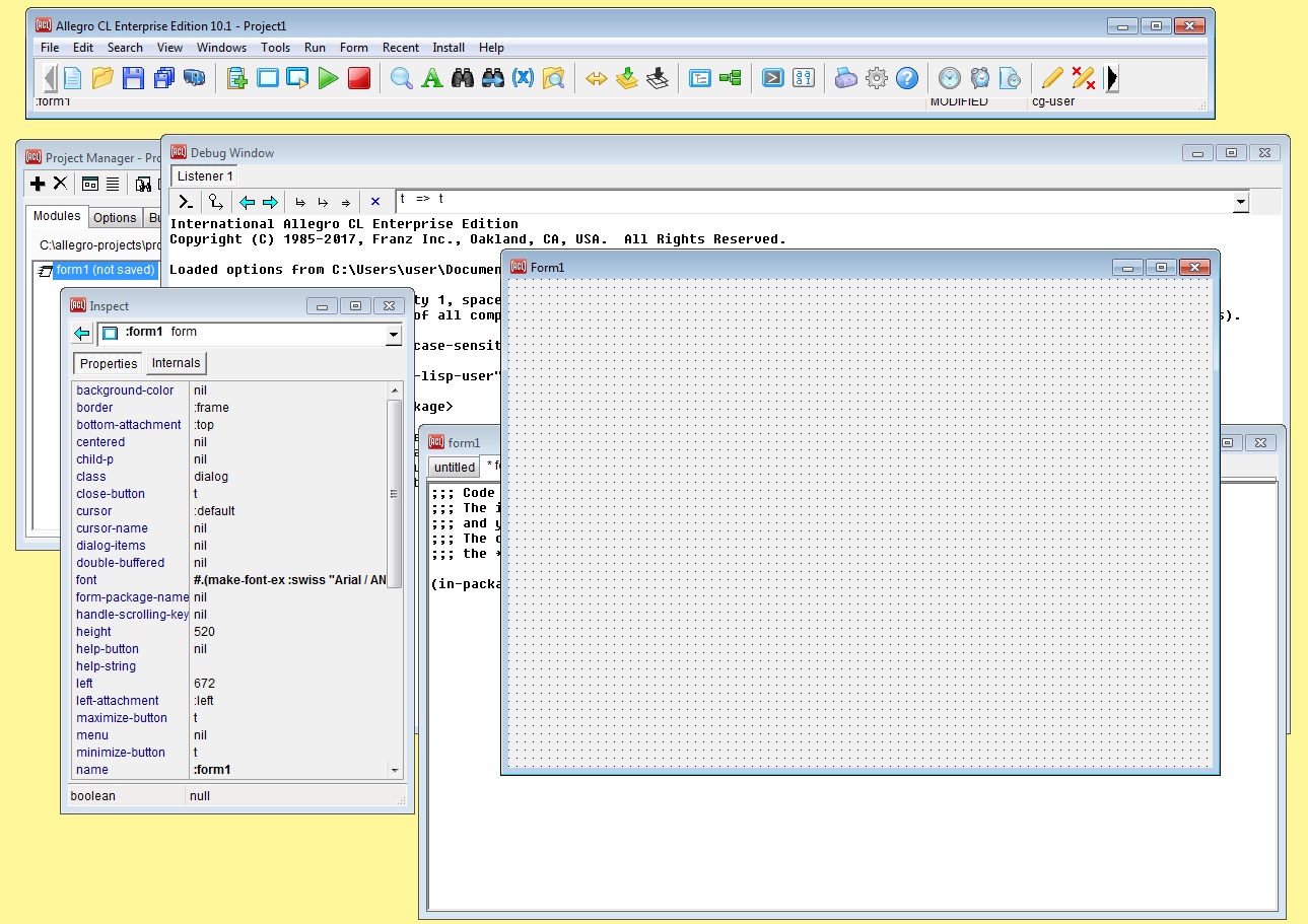
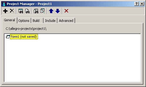
Here is approximately what the system looks like when we have a project with one form (form1):
We got this configuration by opening a project and then choosing New Form from the File menu, specifying Dialog for the type of form. We were asked where we wanted the project files to be saved, and accepted the default c:\allegro-projects\project1\. (If you have used projects before, you may be using project2 or project3 rather than project1.) You should have a directory associated with the project. If we save files, we will save them here, as that makes cleanup easier. It is actually not necessary to save files for the first example, but if you do, it is best to place them is the project directory.
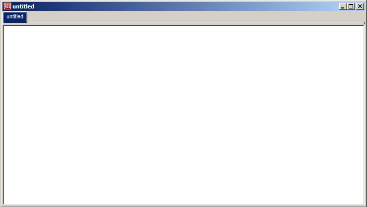
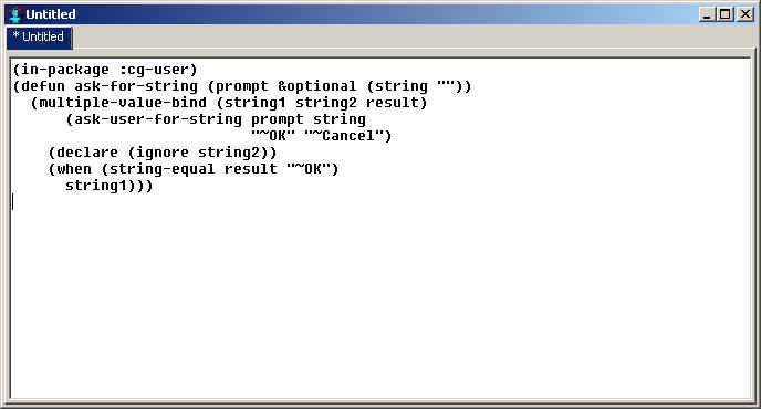
Second, we need to define a function that will be used in the application. This function will display the dialog asking for a string. Go to the editor workbook window (click View | Editor if the editor workbook is not visible -- that command brings it to the front). This window uses a tab control to display editor buffers, which may or may not be associated with files. It starts with a single unsaved buffer named Untitled (there may be a form1 buffer as well):
Add the following to Untitled:
(in-package :cg-user)
(defun ask-for-string (prompt &optional (string ""))
  (multiple-value-bind (string1 string2 result)
      (ask-user-for-string prompt string
                           "~OK" "~Cancel")
    (declare (ignore string2))
    (when (string-equal result "~OK")
      string1)))
While typing this in, try some editor tricks:
Bring up the Apropos dialog by clicking Search | Apropos. Enter ask-user-for in the String box and click Search. All symbols whose names start with ask-user-for are displayed; ask-user-for-string is at the bottom.
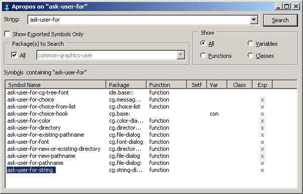
Select it by clicking on it (it is selected in the illustration). Edit | Copy copies it to the clipboard. Back in the Untitled buffer, Edit | Paste pastes it into the buffer. Pressing F1 causes the help page for ask-user-for-string to be displayed.
Search | Complete Symbol displays a menu of choices (a dialog if there are a lot of choices). When you get to multiple-value-bind, only type multiple-v and click Search | Complete Symbol. This pop-up menu is displayed:
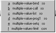
Now press `a'. The `a' choice, multiple-value-bind, is printed in the editor.
Notice too that the Lisp code indents as you go to new lines. When you are done, the buffer should look like this:
Place the cursor just after the final parenthesis (or anywhere within the definition) and click Tools | Incremental Evaluation. You should see ask-for-string printed in the Debug window. That indicates that the function definition has been evaluated in the Lisp environment, as we want.
Note that there are shortcut keys for most of the menu choices we have mentioned (typically Control-C for Edit | Copy, Control-V for Paste, Control-. for Symbol Completion, and Control-E for Incremental Evaluation). However, your editor mode may use those key combinations for editing operations making them unavailable as menu shortcuts. The shortcuts are shown in the menu. Use them in preference to the menu if desired and if they are not used by the editor.
Now we can design our application window. We will work with the current project and form. Display the Project Manager window by clicking View | Project Manager.
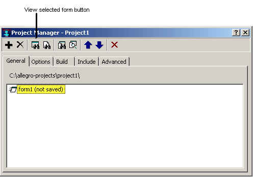
Now select the blank form. If it is not visible, click on (and so select) form1 (not saved) in the Project Manager and click on the View Selected Form button (shown in the illustration).
The form should appear. The Inspector should be inspecting Form1. If it is not (or is not visible), double-click on the interior of the blank form. The Inspector, inspecting form1, will appear.
Also now display the code associated with form1 in an editor buffer. Do this by selecting form1 in the Project Manager dialog and clicking on the View Selected Code button.
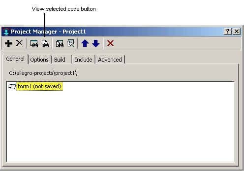
This will display an unsaved form1 buffer in the Editor Workbook.
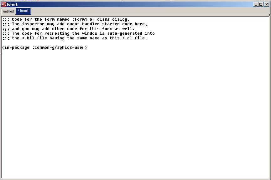
We will be adding code for event handlers for controls on the form in this buffer presently. (Note: if we do not display this buffer before we start editing event handling code, the initial event handling function code is stored in a hidden buffer. Then when this form1 buffer is used, redefinition warnings will be displayed when the code is compiled. Such warnings, if they appear, may be safely ignored.)
Now back to the inspection of Form1. (Double-click on the form if the inspector is hidden). The inspector looks like this:
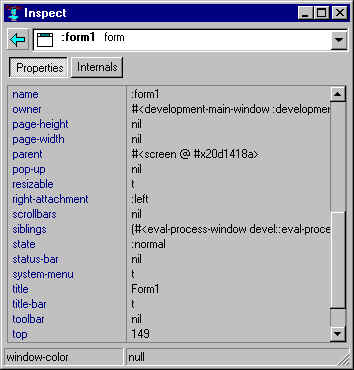
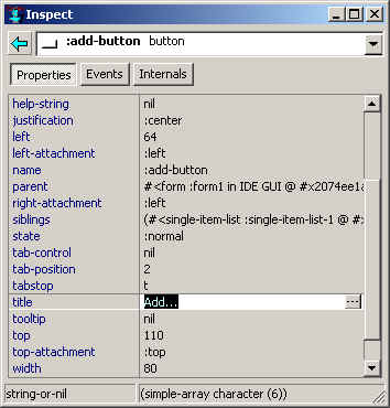
Change the title of the form to Simple Example by selecting the original value (Form1) as follows. Select the text (Form1) which is the value of the title property and type Simple Example. Alternatively, click on the extended editor button (with the three dots, on the right, when the title property is selected, and replace Form1 with Simple Example in the dialog that appears and click OK. The title of form1 will change to Simple Example. (This change is already made in the illustration.)
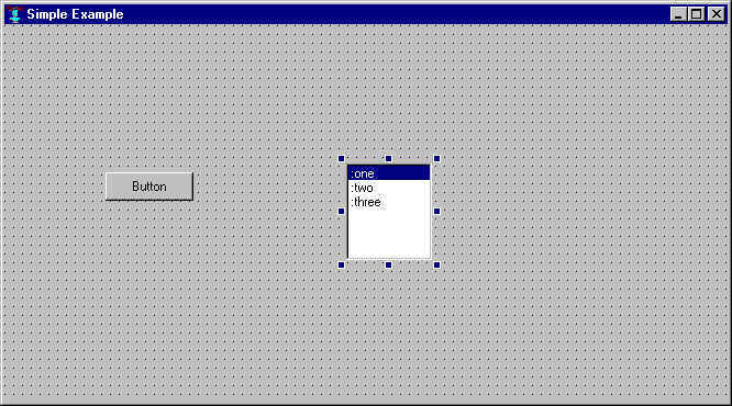
The form will now look like this:
We want to change the name and the range of the single-item-list. Select the
single-item-list by clicking on it. Sizing handles (the solid squares) appear around the
selected component, as in the illustration. The Inspector window should now be inspecting
the single-item-list component. Click in the name
property, and type :list-box. Then click in the range field and type nil.
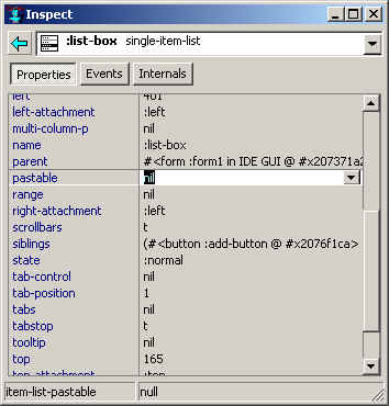
Here is the Inspector after both changes have been made. Notice the single-item-list on
the form is now blank (not illustrated). That is because we have set the range (the things
displayed) to nil. In the application, when a user clicks the button, a
dialog asking for a string will appear and whatever the user enters will become an item in
the single-item-list.
Now we want to change the name and the title of the button. Select the button, and go to the Inspector, change the name field to :add-button and the title field to Add…. Here is the Inspector when those changes are made. Also notice the title of the button on the form is changed to Add… .
We want to specify the behavior when a user clicks on the button. When the user clicks, the on-change event handler for the button (if there is one) is called. We need a handler function that asks the user for a string and makes the result an item on the single-item-list.
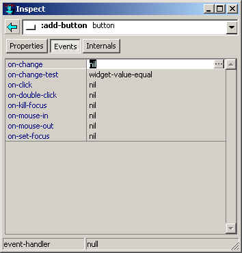
To modify the on-change event handler for the button, select the button and look
at the Inspector. Click on the Events button and you will see the event handlers for the
button. Actually, there aren't any – all the values are nil meaning all
events are ignored (the on-change-test,
the only item whose value is not nil, is an exception we do not discuss
here).
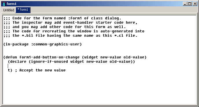
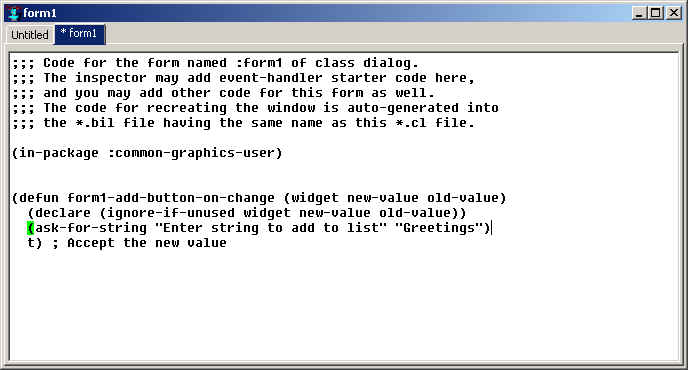
The cursor should be in the blank line in the middle of the function definition. Enter the following line. The modified editor should look like the illustration.
(ask-for-string "Enter string to add to list" "Greetings")
After you have saved the files or not, an active dialog appears. When you click on the Add button, a dialog asking for a string, with default Greetings, should appear. We show part of the form and the two dialogs.
(declare, like this: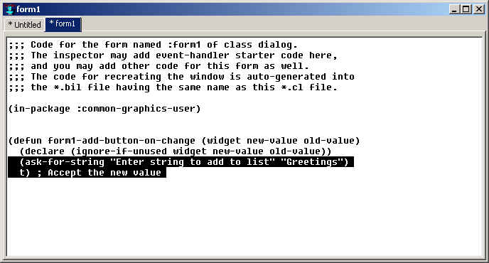
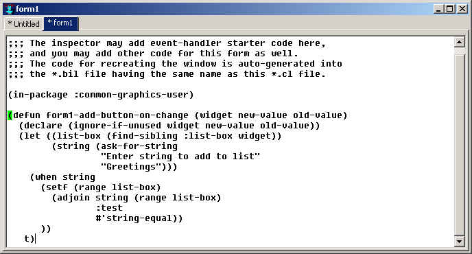
Add the following code, replacing all the current code below the declare line. The illustration shows the appearance after these lines are typed in. Note that the text is indented a couple of spaces and is indented after pasting in the editor buffer. It is important that no left parenthesis except the very first in a Lisp form (the one before defun in our window) be in the first column, or the editor will be confused about where the Lisp form actually begins.
  (let ((list-box (find-sibling :list-box widget))
        (string (ask-for-string
                 "Enter string to add to list"
                 "Greetings")))
    (when string
      (setf (range list-box)
        (adjoin string (range list-box)
                :test
                #'string-equal))
      ))
   t)
Note that list-box was found using the function find-sibling and the name, :list-box.
There are a number of find- functions. find-sibling is best in this case because
only the other controls on the form have to be examined. This function now changes the
range of list-box to include the entered string (adjoin adds an item to a list if
it is not already there – if the new string is equal to a string already in the
range, it is not added).
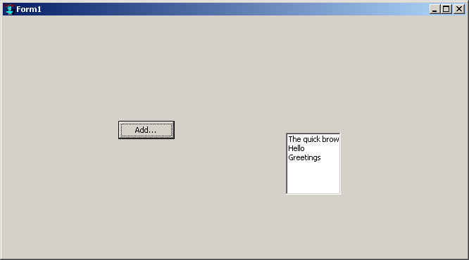
We now have a dialog with the controls communicating with each other. And we were able to modify the behavior while the form was running.
We can convert this simple example into a standalone application. Early in the example, we mentioned the Project manager window and used it (if needed) to display the blank form. Since then we haven't said much about projects.
A project is a collection of modules associated with an application. With the modules and Allegro CL itself, you can build your application. Modules are parts of the application and have one or more associated files. Form1 is a module and has associated files form1.cl and form1.bil (we discuss these types of files in more detail in chapter 4).
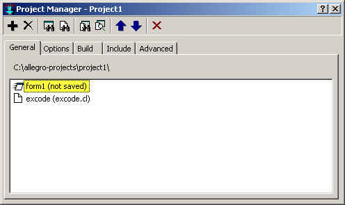
We have to be sure that the project contains all the modules necessary, form1 and the untitled (or excode.cl if you saved it) files. Lots of files are included in an application so we strongly recommend that you start with an empty folder (like the C:\allegro-projects\project1 subfolder suggested by the system early in this discussion).
If you have saved excode.cl already, you were asked whether you wanted the file added to the current project. If you answered `yes', the file will be included in the project. If you answered `no', the file would be saved without adding it to the project. Suppose that is what you did. You can add that file (or any other) to the project at any time as follows:
A Creating Image window is created (it is not displayed by default but it appears on the run bar). Information about what is happening while the application is being built is printed in that window. Note that you cannot do anything while the image is being created other than waiting. When the build completes (assuming it is successful), a dialog like this appears:
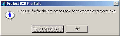
If you click Run the EXE File, the application will run. If you click OK, you return to the running Lisp and the IDE.
Look in the C:\allegro-projects\project1 folder. You should see project1.exe and a bunch of other files.
You can start project1.exe by double-clicking on it to run the application. End the application by clicking on the Close button of the dialog.
The Doodler tutorial is another application whose complete source is included with the IDE. The tutorial illustrates features of the Allegro CL IDE. We recommend that you run the tutorial separately. Here we discuss features of the final product rather than taking you through it step by step.
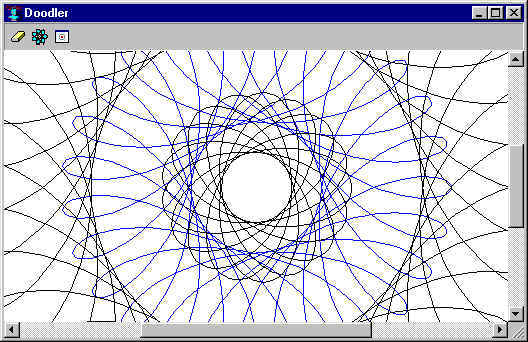
The code, examples, and so on can be found in the gui-builder-tutorial folder and its subfolders. We strongly recommend that you use the tutorial to familiarize yourself with the product. It exercises many of the features of the system, often showing more than one way to achieve a particular end. It provides many programming examples (already written). Our hope is that parts of the tutorial will give you examples that will be useful to you in your own program design. And the result is a program that is at least visually interesting even if it is not directly relevant to whatever application you want to write.
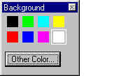
The tutorial application is called the doodler (the name of the project is the :interface-builder-tutorial project). It has four windows and dialogs: one for choosing a background color,
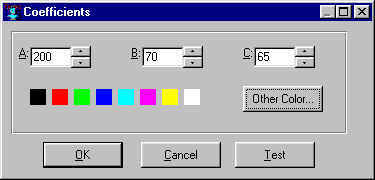
one for defining a cycloidal curve (by specifying the three relevant coefficients),
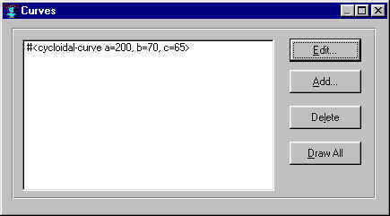
one for listing and managing the curves defined,
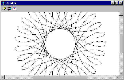
and the main window upon which the specified curve or curves are drawn.
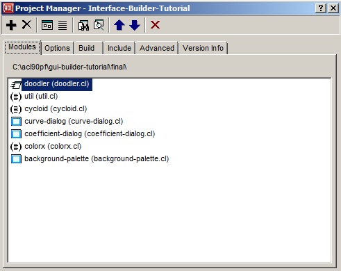
The files in the final subfolder of the tutorial folder show all the files associated with the interface-builder-tutorial application after it is completed. Except for the files util.cl, cycloid.cl, colorx.cl, all of which implement the application – drawing the curve and choosing a color -- and the several bmp files, providing the illustrations for the buttons, all the files needed for the application are generated using the Allegro CL IDE. (Some files, such as the Help file doodler.hlp, provide assistance in using the tutorial but are not needed by the doodler application.)
Here are the elements of the project listed by the doodler project manager.
We shall return to the doodler application as this chapter progresses. Now we discuss developing applications in general.
Broadly, the steps to developing an application are these:
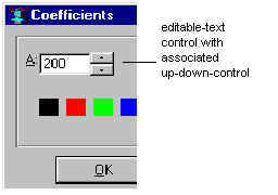
Just as there are many ways to say something, there are many ways to collect input from a user. The doodler mostly uses buttons, but some numeric input uses an editable text control with an associated up-down control:
It also uses a color choice control that is a standard Windows dialog for choosing colors. (Note: that dialog is not associated with one of the forms of the interface-builder-tutorial project. It is displayed by ask-user-for-color.) Many are designed for and can be used for collecting user input. User input from the mouse is still input.
The background color of the drawing pane.
How many curves to draw.
The A, B, and C coefficients of each curve.
The line color of each curve.
Additionally, the user can erase the drawing pane, center the drawing pane, and scroll the drawing pane (all information about user desires that must be input somehow).
It is reasonable to have a window that lists all curves and allows the user to add and delete curves from that list. Another window can be used for specifying the details of each curve, and another for specifying the background color. Finally, the user must somehow give the command to draw the specified curves. This arrangement (a description of the actual interface-builder-tutorial windows) is obviously one choice among many. The draw command could be placed on the doodler window rather than on the curves window, or the erase button could be placed below the Draw All button on the curves window. The background color could be implemented by a Background Color button on the doodler window (that displayed a color choice dialog immediately) rather than having a background color window with a few choices and an option to get more choices. There are no end of possible arrangements, some being obviously unsatisfactory (dialogs for each coefficient rather than one dialog for all three) but many being equally satisfactory.
Notice that this step is longer to describe that the others, because there are so many possibilities and so few reasons to strongly prefer one choice over another.
There are four windows associated with the doodler application. Each window is designed by a form during the design process, so there are four forms in the interface-builder-tutorial project.
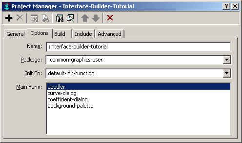
These forms are listed on the Options tab of the interface-builder-tutorial Project Manager. The project started (as all new projects do) with one form. Three others were added after. Each form was added by clicking on New Form in the File menu. When you click on File | New Form, this dialog appears asking for the Window class of the form:
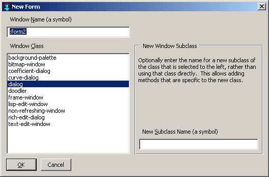
There are more choices shown in the illustration then will be present in a fresh Allegro CL. The additional choices, doodler, curve-dialog, coefficient-dialog and background-palette, were all added as the project was worked on. You are choosing the type of window corresponding to the form. The default choices (everything but the four listed as new) provide many capabilities, but creating new classes of devices is common because you get to add features to the new device class without affecting any existing example of that class. Consider the doodler choice (the device of the doodler window). The doodler class is defined as follows (in final\doodler.cl):
(defclass doodler (bitmap-window)
    ((doodler-curve-dialog
           :accessor doodler-curve-dialog
           :initform nil)
        (doodler-background-palette
              :accessor doodler-background-palette
              :initform nil)))
That says doodler is a subclass of bitmap-window (a bitmap window is one with an interior bitmap-pane upon which you can draw). It has two additional slots: doodler-curve-dialog and doodler-background-palette. They are not initialized. Later, they are given as values the two dialogs (corresponding to the curve-dialog and background-palette forms). A show-curve-dialog method is defined as follows:
(defmethod show-curve-dialog ((window doodler))
     (let* ((dialog (doodler-curve-dialog window))
                      (curve-list nil))
             (when (or (not dialog)
                       (not (windowp dialog)))
                        (setf dialog
                          (make-curve-dialog :parent window))
                        (setf (doodler-curve-dialog window) dialog)
                        (setf curve-list
                          (find-widget :curve-list dialog))
                        (setf
                         (range curve-list)
                         (list
                          (make-instance 'cycloidal-curve)))
                        (move-window dialog
                                     (window-to-screen-units window
                                       (make-position
                                        (- (+ (exterior-width dialog) 10))
                                        40))))
             (select-window dialog)))
This method is specialized to instances of the doodler class (and thus cannot affect any other window in the system). Without analyzing the code too closely, if the value of the doodler-curve-dialog slot is non-nil, it is assumed to be a curve-dialog and displayed; if it is nil, a curve-dialog is created and displayed. The argument to this method is the current window (a doodler window).
Why are things done this way? The design is to have a button on the doodler window which, when clicked, displays the associated curve-dialog. This is implemented by having the system call show-curve-dialog with the parent (doodler) window as its argument when the button is clicked. That action displays (creating if necessary) a curve-dialog associated with the doodler window. The dialog knows which doodler window it is associated with (because that doodler window is its parent) and the doodler window knows which curve-dialog it has (because it is the value of the doodler-curve-dialog slot of the doodler window).
Windows has provided many standard (called common) dialogs for common actions. One is the file choice dialog (a dialog that lets you pick a file on the system) that everyone is probably familiar with. Another is the color choice dialog. The background-color dialog allows a user to choose a background color for the doodler window. Several choices are provided along with a way to get many more choices and even make a custom color using a common color-choice dialog (clicking the Other Color button).
Let us look at how this is implemented. The code is in background-palette.cl (the code associated with the background-palette form) and colorx.cl, an auxiliary source file not specifically associated with a form. In background-palette.cl, we find the function called when the Add Colors button is clicked:
(defun background-palette-color-button-on-change
          (widget new-value old-value)
    (declare (ignore-if-unused widget
                               new-value old-value))
    (when new-value
           (add-other-color (parent widget)))
    (not new-value))
add-other-color, defined in colorx.cl, is defined as follows:
(defmethod add-other-color ((dialog color-mixin))
     (let* ((new-color (ask-user-for-color
                        :initial-color (current-color dialog)))
                      (color-list (find-widget
                                   :color-list dialog))
                      (color-name nil))
            ;; do nothing if user canceled
       (when new-color
            ;; do not add color if it already is on the list.
  #| So far, a color-choose common dialog has been displayed and the user
     has either specified a new color or canceled. If a new color is chosen,
     it is added to the list of defined background colors and the multi-picture
     button is expanded to include the new color.
   |#
           (when (not (setf color-name
                        (find-color-name dialog new-color)))
                   (setf color-name (new-color-name dialog))
                   (let* ((colors (range color-list)))
                             (setf (range color-list)
                               (append colors
                                       (list (make-instance 'button-info
                                               :name color-name
                                               :image new-color
                                               :string nil
                                               :height nil
                                               :tooltip nil
                                               :help-string nil))))))
            ;; change which color is pressed
            (setf (value color-list) (list color-name)))))
The call to ask-user-for-color pops up a color choice dialog. The add-other-color function does what is necessary when a new color is chosen. You can mimic the code here when you want to pop up a common dialog and use the result of user action in your application.
Go to chapter 4. Go to beginning of this chapter.
Copyright (c) 1998-2017, Franz Inc. Berkeley, CA., USA. All rights reserved.
Documentation for Allegro CL version 10.1.
Created 2017.2.27.
|
Allegro CL version 10.1 |