|
Allegro CL version 9.0 |
This document contains the following sections:
5.1 Adding a component to a form
5.2 Component overhead
5.3 The types of components
5.4 Component properties
5.5 Programmatic considerations
5.6 Properties common to most visible components
5.7 Positioning components
5.8 Components that work together
This is chapter 5 of the User Guide for the Allegro CL 10.1 Integrated Development Environment (IDE).
The chapters of the IDE User Guide are:
Chapter 1: Introduction to the IDE
Chapter 2: The Allegro CL Development Environment (IDE)
Chapter 3: An example
Chapter 4: Projects
Chapter 5: Components (this chapter)
Chapter 6: Designing a user interface using forms
Chapter 7: Menus
Chapter 8: Events
A component is an object used in developing the user interface to your application. This broad definition includes forms and things that can be put on forms. Informally, components are things that can be placed on forms. Visible components that can be placed on forms are called controls or widgets.
Recall the steps in designing a window in your application's user interface are:
Creating a form is described in chapter 4 and chapter 6.
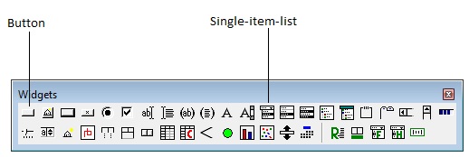
When viewing a form window that is selected, first click in the interior of the form to expose the Widget Palette. (Or use the Form | Show Widget Palette.) Then click on the button in the Widget Palette corresponding to the control of interest. In the illustration, we have identified the Button and Single-item-list controls:
Then click and release on the form to position the component with default size and upper left corner where you click or click and drag on the form until the rubber band box is the size you want. If you click and drag, the clicked on point is a corner but which corner depends on the direction you drag. That places the component on the form. While the component on the form is selected, the Inspector displays information about the component and can be used to customize the component as you want. The component can also be resized using the sizing handles around the component while it is selected.
Once a component is placed on a form being designed, it can be moved and resized using the mouse. As it moves about, alignment cues appear between it and other components allowing you to align it precisely with respect to other components on the form.
Because every control (visible component) has an associated window, controls are expensive to use in terms of memory usage and speed. To the extent possible, programmers should minimize the number of controls that they use. For example, if you want to create a toolbar, each button on the toolbar could be a picture button. Or, all the buttons could be included in a single multi-picture button control. The latter method is preferred because multi-picture buttons have one window rather than a window for each button.
Most components display something and accept input in some fashion. We have divided the available components into several categories:
Components that present choices
. The first two allow more than one choice while the remaining three allow one selection only.check-box: on or off only, but siblings do not affect possible values.
multi-item-list: displays one or more choices, any number of which can be selected.
single-item-list: displays one or more choices, only one of which can be selected.
radio-button: on or off only; only one can be chosen from several grouped together.
combo-box: Similar to a single-item list, but typically only the title is displayed until clicked on, when the rest drops down like a menu.
Buttons.
: displays text and can be clicked on.
Components that display or accept text
editable-text: displays one line of text which can be edited by the user.
rich-edit: displays formatted text that can be edited by the user (associated are the rich-edit-ruler, rich-edit-multipic, font-face-combo-box, and font-size-combo-box).
lisp-text: displays Lisp source code.
static-text: displays text that cannot be edited.
multi-line-editable-text: displays multiple lines of editable text.
multi-line-lisp-text: displays Lisp source code.
Components that display graphics
drawable: a control that can be drawn on with drawing routines.
static-picture: displays a picture.
picture-button: see above under Button controls.
multi-picture-button: see above under Button controls.
Components that scroll
: controls application-defined horizontal scrolling.
Common Controls. These are standard Windows controls.
: a horizontal bar with divisions suitable for a title.
Allegro controls. This are specific to Allegro CL.
: provides a visual grouping of other controls.
Each pre-defined component has many properties which determine the appearance and behavior of the component. Certain properties are common to all components while others are specific to components of specific types and others apply to one component only. Properties may have the same name (and general purpose) but the specifics may differ between different components. Thus, both the group-box and the multi-item-list have border properties, but the possible values differ and the range of possible appearances differ correspondingly.
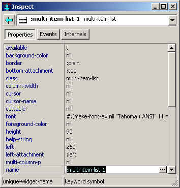
When a component on a form being designed is selected, the Inspector window shows the properties (on the left) and the current value of the property (on the right) for the component. Here we show the properties of a multi-item-list:
You can change the value of a property by clicking on the value field (unless the property is read-only). The component on the form changes immediately when a property is changed. If you are running a form, the running window is not affected by changes made to components in its associated form. When files associated with a project are saved, the new values specified to the inspector will be reflected in the newly saved source. When you run a form or project, you are prompted to save all unsaved modifications, then the project is compiled and loaded, and, when running the project, the init function is run (the init function is not run when running the form). The default init function creates and displays the window associated with the main form only. You cannot (conveniently) use the inspector to change a property of a component in a running window. You must make the change, and re-run the project. You can make the change while the project is running or not..
Every component supplied with Allegro CL is described on its own page in the online help system. (Every component is associated with a class and the class and the component are described on the same page.) The online help is intended to provide the most information about a component and how programmers can affect its behavior and appearance. The purpose of this section is to provide an overview of component properties and to give hints and pointers about what the issues are when working with components.
For most properties, the same symbol names the property and the function that accesses
and (if settable) with setf sets the property value. Thus the name property is accessed by the name function and set with (setf name).
Most properties can be specified when a component is created programmatically (look at a .bil
file to see examples). The initarg for the property is usually the keyword with the same
name, thus :name for the name property, but not always. See the description
of initarg in online help.
Instances of components are created with cl:make-instance. To create a multi-item-list, you do
(make-instance 'multi-item-list ...)
Property initargs can be specified in the make-instance form. As we said, to see code that creates a component and places it on a dialog, start a new project (for testing), place the components of interest on the project's form, save the project and look at formn.bil in whatever directory the project was saved. (formn is the name of the form, form1, form2, etc. unless you specifically change the name).
Just because two components have properties with the same name, that does not mean that the property behaves the same way or can have the same values – we gave the example of the border property for group-boxes and multi-item-lists above. Here we provide a general discussion of properties common to many components. The online documentation gives specific information on properties of components.
You can specify access keys for many components with a title, typically by putting a tilde (~) before the letter you want to be the access key in the value of the title property. The tilde does not print but causes the following letter to be underlined. Alt plus that letter, or just that letter can have effects similar to setting focus on the control with the mouse.
While a form is being designed, clicking on a component selects it. An indication of being selected is the sizing handles around the component. These allow the control to be resized with the mouse. The component can also be moved with the mouse. As components are moved, alignment cues appear as the component moves into alignment with other controls on the form, allowing you to line components up precisely as you want.
Note that when you are designing a form, the attachment properties do not work. For
example, if a component has right-attachment
:right, expanding the window to the right (by placing the mouse over the
right side until a double-headed horizontal arrow cursor appears, clicking down and moving
the mouse – all this is standard Windows behavior), the component should resize as
the window resizes. However, when you resize a form, the components on the form do not
resize regardless of the value of their attachment properties. This is intentional. On a
form, you should be able to size the form and all components as you want them to look when
the window first appears. If changing the size of the form changes component sizes as
well, the design process would be tedious.
Some controls including scrollbars (horizontal-scroll-bar and vertical-scroll-bar) and up-down-controls are often associated with another control, though most components that are scrollable have their own (system-supplied) scrollbars, so scrollbar controls usually affect some attribute other than positioning. An up-down-control will automatically associate itself with an editable-text control placed next it on a form (the editable text control becomes the buddy-widget of the up-down-control). Scrollbars, however, never automatically associate themselves with another control. The program (that is you as the programmer) has to use the on-change event handler of the scrollbar to produce whatever effect you want when a scrollbar is modified by a user.
The default range of an up-down-control is (0 100). Change the value of the editable-text widget to (say) 1 by clicking on the extended editor button and entering 1 in the editor window that appears.
Now run the form (by clicking on Run Form or Run Project in the Run menu). You can change the value in the editable-text control by editing it directly (as usual) but also by clicking on the up or down arrow in the up-down-control.
Go to chapter 6. Go to beginning of this chapter.
Copyright (c) 1998-2017, Franz Inc. Berkeley, CA., USA. All rights reserved.
Documentation for Allegro CL version 10.1.
Created 2017.2.27.
|
Allegro CL version 10.1 |