| Allegro CL version 10.1 Unrevised from 10.0 to 10.1. 10.0 version | ||||||||||
The class of all grid-widget controls.
An instance of the grid-widget class. This is a very
versatile (and therefore relatively complex) widget that is useful for
implementing things such as spreadsheets and tables. Grid cells can
either use built-in cell widgets or implement custom drawing and
mouse/keyboard behavior.
A grid-widget may be divided into multiple sections, each of which may be independently scrollable and resizable. Within each section are rows and columns that are collectively known as subsections. (Sections are sometimes referred to as main sections to distinguish them from subsections.) Rows and columns may be interactively resized, moved (to change their order), selected, and deleted, whenever each of those options is enabled. Rows and columns may be added and removed programmatically at any time. A row or column can have its own individual stylistic properties, and can also be replicated to produce a set of identical visual rows or columns that are represented by a single row or column lisp object.
Each section, row, and column is implemented as a standard-object. A grid cell does not
have a Lisp object to represent it because the number of cells
increases quadratically as the rows and columns increase. Instead, a
cell is accessed by methods that specialize on both the row and column
whose intersection defines the cell.
The Examples tab of the Navigator Dialog has several Grid widgets examples. We illustrate some here.
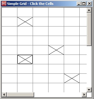
Here is Grid-widget: the simplest possible grid-widget-example. A simple grid. Left click on a cell and an X is marked (as we have done with several). Right click and the X goes away. Note the scroll bars. The widget is bigger than the window displaying it.
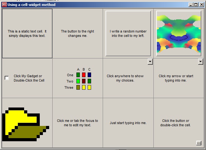
Here is a more complex example Grid-widget: using built-in cell widgets in ARBITRARY cells.
All these examples (and there are several more) are available to run and the code the generates them can be examined and adapted or reused. See the Examples tab of the Navigator Dialog.
Using a grid-widget consists of constructing the grid-widget from sections and subsections, specifying various stylistic properties, and (the trickier part) writing methods that control how various grid cells read application data to display, draw themselves based on that data, respond to mouse clicks and keypresses, and finally write user-modified data back to the application.
Normally you will first define subclasses of various grid classes so
that you can specialize methods on them. The basic classes to
subclass are grid-widget, grid-row-section, grid-column-section,
grid-row, and
grid-column.
When you create a grid-widget instance, specify its row-sections property as a list of
instances of your grid-row-section subclasses, and
its column-sections property as a list
of your own grid-column-sections. When making
each grid-row-section or grid-column-section, specify its subsections property as a
list of instances of your grid-row or grid-column subclasses
(respectively).
Optionally, you can also specify the section-count property of a row or column to make that single row or column lisp object produce multiple identical visual rows or columns, which are distinguished by an index only. Subsections can also be added and removed later by calling add-row, add-column, delete-row, and delete-column. Call make-instance as usual to create each object.
Grid sections and subsections have various properties that determine how they appear and behave mechanically. These may be specified when creating each object and/or changed anytime later. Some of these properties apply to both sections and subsections, including resizable, section-size, border-width, border-dashing, border-color, and proportional. Properties that apply only to sections include scrollbars, uniform-resizing, empty-color, default-cell-3d-border, default-cell-border-color, and default-cell-border-width. Properties that apply only to subsections include movable, deletable, and selectable.
In addition to writing code to constuct a grid-widget and specify its mechanical behavior, you need to write methods that specify how it displays application data and optionally modifies it. (Further below we discuss some higher-level alternatives that can remove the need to write some or all of these methods.) Here are the basic generic functions to specialize in order to display data in a grid-widget:
grid-row and grid-column that were passed to
it.
If you know that an application value has changed and needs to be redrawn in its grid cell, you still should not call draw-cell yourself; instead, you should force the cell to redraw itself by calling invalidate-cell, or force a whole section to update by calling invalidate-section, or the whole grid-widget by calling invalidate.
There is a default draw-cell method that calls princ-to-string on the value returned by read-cell-value, and draws that string in the cell. If this is sufficient, then you do not need to write your own draw-cell methods.
And here are the basic generic functions to specialize if you also want to allow the user to modify the data interactively in the grid, rather than simply viewing it:
The above generic functions are all that you need to specialize in order to write your data-manipulating grid code from scratch. But there is some additional higher-level grid functionality that can reduce the number of grid methods that must be written for typical applications.
These alternatives are applicable to any application that uses grid rows to represent data objects and grid columns to represent their properties. For example, one of the Navigator grid examples uses grid rows to represent employees, and grid columns to represent properties such as employee name and department. We will discuss that example here.
This higher-level functionality falls into two camps: reader and writer properties, and cell widgets.
The first higher-level alternative lets you avoid writing read-cell-value and
write-cell-value
methods. In an application such as the employee example, you would
probably have an employee class that already has accessor functions
such as employee-name and employee-department. When
representing employees and their properties in a grid-widget, you
could specify the data-object property of each
grid-row as
the employee that the row represents, and specify the data-reader property of
each grid-column as the existing
accessor function (such as employee-name or
employee-department) for the property that the column
represents. If you are allowing the user to modify data values in the
grid, then you could also specify a function such as (setf
employee-name) as the data-writer property of the
column.
It just so happens that the default read-cell-value method calls the grid column's data-reader function on the row's data-object, if both of those exist. And the default write-cell-value method calls the column's data-writer function on the data-object. This means that by specifying data-object, data-reader, and data-writer properties for your grid subsections, you can avoid writing custom read-cell-value and write-cell-value methods for various types of cells. You can still write your own draw-cell methods that call the default read-cell-value method, though, and write custom cell-click and cell-key-down methods that call the default write-cell-value method. See also data-read-converter and data-write-converter.
The other higher-level alternative lets you avoid writing custom draw-cell, cell-click, and cell-key-down methods. It consists of several types of built-in "cell widgets" that know how to draw themselves and how to respond to user gestures to modify the represented value. When using these built-in cell widgets, you can still write your own read-cell-value and write-cell-value methods that will be called automatically by the built-in cell widget code. Or use both of these higher-level alternatives together to avoid writing any custom methods.
Since there is not an object for each grid cell, the built-in cell
widgets are defined as mixin classes that you combine with a grid-column class.
The defined classes are editable-text-column-mixin, check-box-column-mixin, combo-box-column-mixin, static-text-column-mixin,
static-text-and-button-column-mixin,
pixmap-column-mixin, and
lamp-column-mixin.
The pseudo-widget will appear in any cell whose column is an instance
of one of these mixin classes and whose row is an instance of the
widget-row-mixin class. This
design lets you specify a type of widget for some subset of the cells
of a grid column. This is appropriate for applications that use a
grid column to represent a property, since typically the same widget
would be appropriate for editing a particular property regardless of
which data object (grid row) is being edited.
Typically you would have a header row or row-section that does not
have the widget-row-mixin, and then a number
of "body" rows that do have it, so that the widget does not appear in
the header row. See also row-header-column and column-header-row.
A quicker but less object-oriented way to use the built-in cell
widgets is to write cell-widget methods. This bypasses the widget-column-mixin and widget-row-mixin classes
altogether, and allows the widgets to be used in arbitrary cells
rather than only in particular columns for each type of widget.
If you are using a built-in draw-cell method that's supplied by a cell widget, or the default method that displays any cell value as a string, then you can still exert some control over how a cell draws itself. You do this by writing trivial methods that return specific aspects of the drawing style. The generic functions to specialize include cell-font, cell-background-color, cell-foreground-color, cell-horizontal-padding, cell-vertical-padding, cell-horizontal-justification, cell-vertical-justification, cell-wrapped-p, cell-3d-border, and data-read-converter. Each built-in draw-cell method will call some subset of these generic functions and use the values that they return.
By default, an application's read-cell-value method (or a data-reader function that the default method
calls) is called every time a cell is drawn to return the value to
display. If this code takes significant time, then these calls can be
minimized by setting the grid-widget's cache-cell-values property to true.
Similarly by default, an application's write-cell-value method (or a data-writer function that the default method
calls) is called immediately whenever the user interactively edits the
value in a grid cell. To delay these calls that modify application
data until the user either confirms or rejects recent edits sometime
later, set the grid-widget's delay-write-cell-value property to true.
Perhaps it will be clear at this point that read-cell-value and write-cell-value exist primarily because the higher-level grid features uses them to separate the functionality that they provide from the methods that you still have to write. So if you are not using either higher-level alternative, then a draw-cell method actually would not need to call a separate read-cell-value method, and could instead fetch its application data to draw directly. Similarly, a cell-click or cell-key-down method would not need to call a separate write-cell-value method, and could instead modify the application's data directly. The "simple color editor" example in Navigator Dialog is an example of this.
A grid-widget can be added to a form interactively as with other
widgets, but it is probably simpler to write all of its code
programmatically, due to the need to define subclasses and properties
for sub-components. To usefully add a grid-widget to a form
interactively, you probably should first define the subclasses for
your grid-widget, sections and subsections, and give them
default-initargs that specify the properties that you would like for
their instances, and then call add-to-component-toolbar to add
your customized grid-widget class to the widget palette.
A higher-level alternative that is already in the widget palette is
the class-grid. A class-grid works well when created
interactively on a form because all of its customizable properties are
at the top level rather than on grid sections.
Please refer to the multiple grid-widget examples in Navigator Dialog for complete example code. And to look up additional grid functionality that was not covered here, look at the Allegro Tree of Knowledge (displayed with the Help | Tree of Knowledge menu command). In that dialog, do Search | Find Forward on the string "grid-widget".
A diagram of window and widget classes is shown in Widget and window classes in cgide.htm.
Copyright (c) 1998-2022, Franz Inc. Lafayette, CA., USA. All rights reserved.
This page was not revised from the 10.0 page.
Created 2019.8.20.
| Allegro CL version 10.1 Unrevised from 10.0 to 10.1. 10.0 version | ||||||||||