| Allegro CL version 10.0 This page is new in 10.0. | ||||||||||
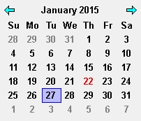
This widget displays a calendar that always has a particular date selected. The user can select a different date in a variety of ways.

The value property of the widget always contains a universal time integer for the currently-selected date. (Due to using Lisp universal times, dates before 1900 cannot be selected.) You can set the slected date with (setf value) applied to a calendar instance. The new value must be an integer representing a universal time.
If you set the selected date programmatically by passing a universal time to (setf value), it may be prudent to use a universal time whose time of day is not within an hour of one AM to avoid any possible confusion related to daylight savings time. Internally the widget arbitrarily always specifies 4 AM to encode-universal-time when the user selects a date interactively. Other than that, the time (hour, minute, second) of the universal time which is the value is ignored.
In the main mode, all of the dates of a single month are displayed at any one time, with a row for each week. The user can browse to other months, and also switch to three alternate modes that display an entire year, decade, or century.
The user can click any "cell" in the calendar to select a date when a month is displayed, or to select a month when a year is displayed, and so on. The arrow buttons in the top right and left corners can be clicked to display the next or previous "page", such as the next month when a month is displayed or the next year when a year is displayed. Clicking the title displays the next higher level, such as the year that contains the month that was displayed. Clicking a value in a higher level displays the selected value at the next lower level; for example, clicking July when a year is displayed displays the dates of July of that year. This allows selecting any date by "zeroing in" on it in a top-down manner.
Here are the keyboard alternatives for navigating the calendar (letters should be entered un-shifted -- they are shown uppercase because that is the standard was to identify keyboard letters):
| Action | Equivalent key or letter |
| Select the cell to the right | R or RightArrow |
| Select the cell to the left | L or LeftArrow |
| Select the cell above | U or UpArrow |
| Select the cell below | D or DownArrow |
| Display the next page | N or PageDown or Control-RightArrow |
| Display the previous page | P or PageUp or Control-LeftArrow |
| Move to the next higher level | H or Control-UpArrow |
| Move to the next lower level | G or Control-DownArrow or Spacebar |
Some calendar cells are displayed in a special way. By default, the currently-selected date displays a light-blue background and a blue border. The date that's currently under the mouse has a similar style using fainter colors. Today's date is drawn with red text. And dates for the next and previous month (which share the first and last week of the displayed month) are drawn with gray text. Any of these styles may be modified by using the cell-style, cell-style-selected, cell-style-under-mouse, cell-style-current-date, and cell-style-other-month properties of the widget, respectively. And you can avoid drawing today's date in a different way by simply turning off the highlight-current-date property.
Here are some other calendar properties that control the layout and drawing style of the widget:
The following properties may be read to retrieve the individual parts of the currently selected date, as an alternative to parsing the universal time that's in the value property. A new date can be selected programmatically only by setting the value property, though.
Copyright (c) 1998-2019, Franz Inc. Oakland, CA., USA. All rights reserved.
This page is new in the 10.0 release.
Created 2019.8.20.
| Allegro CL version 10.0 This page is new in 10.0. | ||||||||||