|
Allegro CL version 11.0 | ||||||||
When designing a dialog interactively by placing widgets onto a form window and then specifying their properties in the inspector, the grid-widget is relatively tricky due to its large programmatic interface for most any imaginable custom table or grid. But for typical relatively simple grids, it is in fact not that difficult. So here's a brief tutorial to get you started.
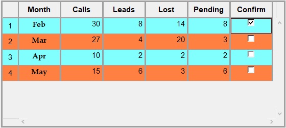
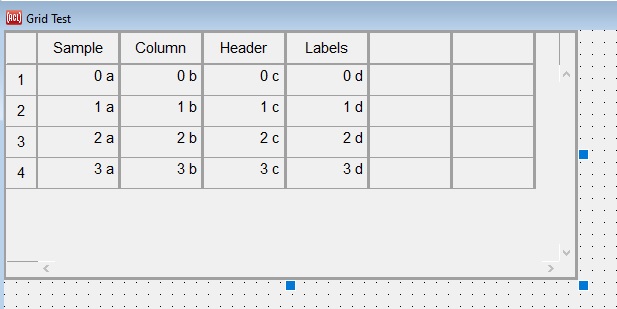
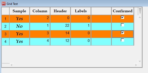
We are going to build the grid widget shown above directly on a form. Note we have added the values in the cells below the first row and to the right or the first column but the other labels are built in as is the functionality. After creating this grid example, we will have an example of a spreadsheet widget.
First things first: If you do not have a project yet to add a grid-widget to, then use File | New Project to create a new project. Maybe call it grid-test. Use File | New Form to give the project a form window for designing a dialog interactively. You could call it grid-test as well. Click the new form window to make the widget palette appear. In the widget palette, click the icon that looks like a table with column and row headers and whose tooltip says Grid Widget. Click the form window near the upper left to add a grid-widget to it. Click and drag the grid's lower-right corner to make it bigger. Do a File | Save All to save the whole project.
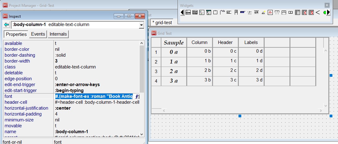
Now double-click the new grid-widget to inspect it and to bring the Inspector Window to the front. (A single click suffices if the Inspector is already in front.) If needed, resize the form window and/or the inspector so that they are side-by-side with no overlap. Your screen should look (in part) like this image:
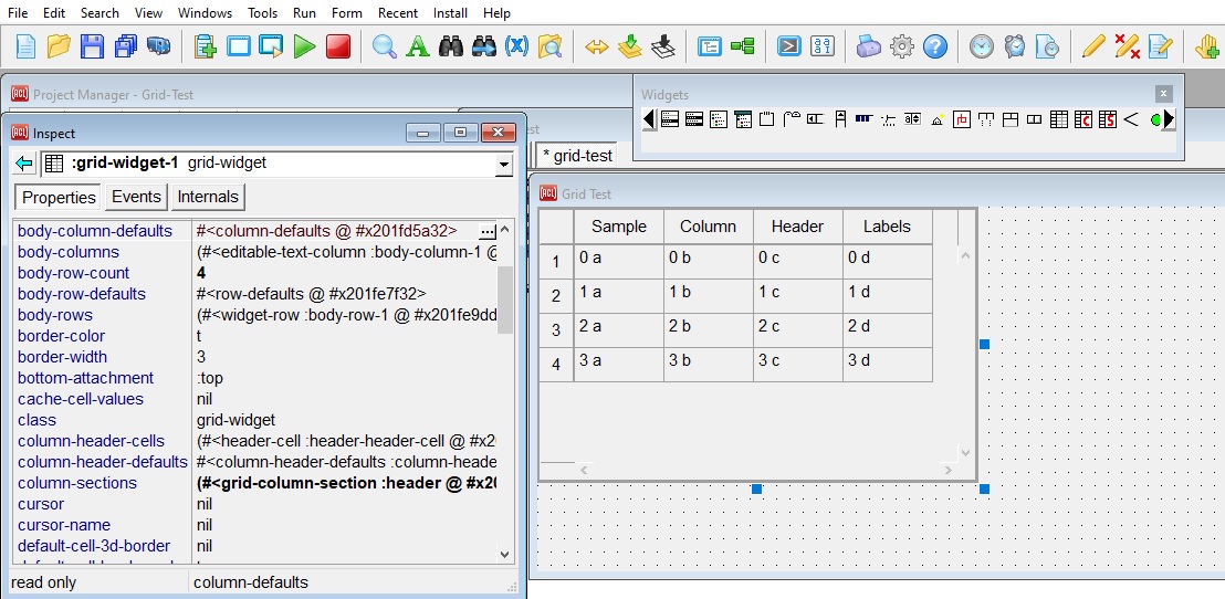
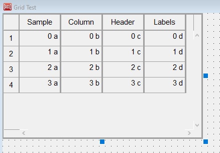
Notice that the starter grid-widget on the form shows sample values in its body cells and header cells. This allows seeing the effects as you change property values, such as alignment values, in the inspector, allowing you to know when you get what you're looking for. These sample values were specified internally by calling (setf cell-value), which this tutorial will tell you how to call later. The body cell values cannot be changed in the inspector. The header values can be as we will get to later.
The body values are left-aligned, but let's say that this grid is going to be handling mostly numbers, where right alignment is more suitable.
In the inspector, click on body-column-defaults (at the top of the inspector window in the image above) in the left column (you may need to scroll up to it) to inspect that child object of the grid-widget. It lists a bunch of column properties whose values will be the default values for all of the columns in the body section. Most of these say :defer, which means that this "defaults object" is not specifying default values, and so they will come from grid-column classes. You're not defining your own subclasses, so you'll use this object for default values instead.
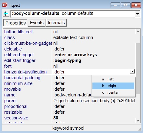
Click on the :defer that's to the right of the property name horizontal-justification. ("Justification" is an older term for alignment, kept for backward compatibility.) Selecting that value causes a small downward-arrow button to appear on the right end. Click that arrow button to show the possible values for this property, and select :right for right-alignment. Notice how the values in the body of the grid-widget jump over to the right side when you make that change. If you missed that, then type Control+Z a couple of times (for Edit | Undo) to undo and redo that change.
While you're at it, change the default border-width property to 3 by clicking the :defer beside border-width and then typing 3 and Enter. Watch the border on the right side of each body column get a thick look. The grid-widget now looks like this:
Now in the inspector, go back up to the grid-widget, either by clicking on the Back button at the upper left or by typing its keystroke, which is Alt+J (highly recommended for speed). (Or you could click parent in the left column to move up to the body column section, and then parent again to move further up to the grid-widget.)
While inspecting the grid-widget again, change the body-column-count from 4 to 6, and see two additional body columns appear as if by magic. Notice how they also have thick borders on the right, due to using the default values that you selected earlier.
Here's a hint for future more general use: The properties whose names start with body are shortcuts for typical grids that have a main section named :body. This includes the starter grid that you get when creating one in this interactive way. In the general case, you would need to go from the grid-widget down to its column-sections object, then further down to its second column-section (which is named :body), and finally change its subsection-count property. So there are certain shortcut properties that are handy when specifying a typical grid-widget interactively, such as the ones whose names begin with body-, header-, and footer- for those common sections.
Now that you have set up some default body column properties, decide that the leftmost body column is going to be different in some ways. Go to the body-columns of the grid-widget, and then to the first column (whose initial name is :body-column-1). This column is not going to hold numbers like the others, so change its horizontal-justification to :center to override the default value for the body-columns of this particular grid-widget. Then select the value beside the font property (initially nil) and click on current value for the font property, and click on the f that appears to the right to show the font selection dialog, and select a different font for this one column. This image shows the new changes. The font we chose is Book Antiqua Bold Italic 14 but you can choose any one you like.
That sequence shows how you can quickly choose default properties for most columns, and then change a few exceptions to the rule. The same works for rows, with similarly named properties. An important point is that when you change a default value, it will change all of the individual columns or rows as well, even ones that you had individually changed. So it's best to first change the defaults as desired (as far as you know so far!) before making exceptions for individual rows and columns.
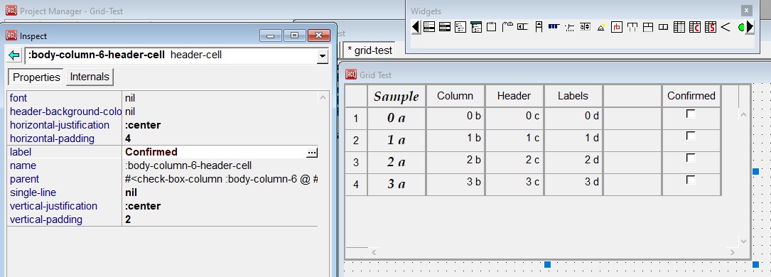
Go back up one step from :body-column-1 (as with Alt+J) to the list of body-columns, and then go to the last column (number 6, body-column-6; click on the 5 to the left). Change its class property from editable-text-column to check-box-column (from the drop-down list on the right), and see check-box gadgets that appear in the body cells of the rightmost column.
You just now changed the actual class of that column, which will cause different built-in methods to be called to make it act like check-box widgets. The starter grid uses editable-text-column for each body column (and widget-row for each body row) to allow the user to type values into each cell. But there are other possibilities.
From this last column, go to its header-cell child. This is another convenience property, which is related to the typical case where a grid has a single header row along the top and/or a single header column on the left. Click in the empty spot for its label property, enter a header label there, and see it appear (we enter Confirmed). Column header labels are one thing that you likely will want to specify at design time, rather then filling them in programmatically at run time. But reaching each header-cell in the way that you just did would require many steps. There is a better way which we will describe, but first an image of what we have just done:
Now for the better way to specify header cell properties. Go three levels back up to the grid-widget, and click on its column-header-cells property, another convenience property for interactive specification. From here you could descend to each header-cell and set its label, and perhaps other drawing style properties that you want to be unique for each column header cell. You could give each header-cell a bold font here, but if you want to give every column header cell the same bold font, then there's a faster way, as we show next.
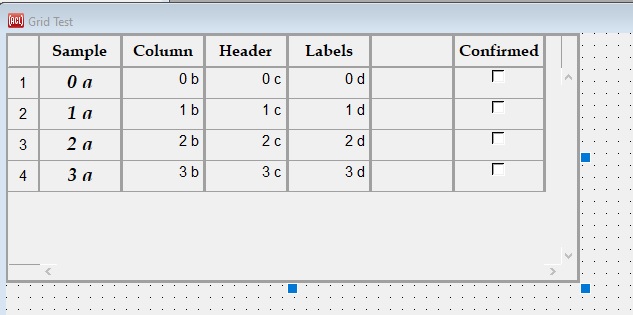
It's common for the row of headers along the top to use a bold font. Most default properties apply to columns rather than rows, but for the column header row there's another convenience property. From the grid-widget, go to its column-header-defaults child, and select a bold font for it (we chose Book Antiqua Bold 12). This will change the font in all of the column header cells. Notice that it does not wipe out any other pre-specified properties such as the labels, though, because those are different properties. Note too that the earlier change we made to the first column's font, which changed the header cell font, is not overwritten for that header cell. Here is what the grid widget looks like now. (The right column was a bit narrow to hold the Confirmed label so we widened it a but by mousing over its right border, clicking and moving to the right.)
While you can navigate in the inspector between the grid-widget and its various parts, there's a shortcut for inspecting a particular column-, row-, or header-cell immediately. In the grid-widget that's on the form window, simply hold down the Alt key and click (also known as Alt+LeftClick) on a particular column that you'd like to modify, and it will appear in the inspector. Or do that on the header cell of a column to inspect that cell directly. A Control+Alt+LeftClick works the same way for grid rows and their header cells. Try that a few times now.
If you do a regular LeftClick on the grid-widget to inspect it again, one more thing you might want to try is to specify its body-background-color-one and body-background-color-two properties. The button on the right in the inspector for those properties allows you to select any colors at all with the color-selecting dialog. If you specify both of those colors, then subsequent body rows of the grid will alternate between those two colors, which is sometimes called banding. (We chose orange and light blue.)
Now use Run | Run Form to try out the real grid-widget as a user would use it (save files when prompted). The body cells will no longer display the sample values, and you can click on a body cell and type a value into it (then typing Enter to submit the value). You can also use the arrow keys to move to another cell, and simply begin typing to change the value of the cell that currently has the focus. The ways that you can begin and end editing a cell value are grid-column options that you could change in the inspector for the body-column-defaults or for an individual column. When a check-box cell has the focus, the spacebar or Enter will toggle it visually, which also toggles the cell's value between t and nil.
Here is the grid-widget running. We have added a bunch of values in cells and checked a couple of check boxes. The fifth column is blank because we have not decided on a use yet. When we stop running the form, the values we added do not transfer to the design grid-widget. We showed them just to illustrate a grid-widget in action.
With the default grid-widget that you create interactively, you can click and drag any header cell to drag any body column or row to a new position, or click and drag the borders on its right and bottom sides to resize it. You can click any column header cell to sort the rows by the values in that column, or click any row header cell to select that row, and then perhaps press the Delete key to delete that row. If you'd like to prevent the user from doing any of those things, then there are options on grid columns and rows, and their defaults objects, for whether to allow each one.
You can use the Lisp listener in the Debug Window to test interacting with the grid-widget as your application code might do at run time. First get a handle on the widget by using the command Tools | Get Component and clicking on the grid-widget in the running dialog (not in the form window where you design it). That will return the grid-widget to the listener, so that the variable * is bound to it. Then in the listener evaluate (setq g *). Now the variable g will be bound to the grid-widget. You may want to resize the Debug Window and/or the running dialog so that they do not overlap.
Now evaluate the expression (setf (cell-value g 0 1) 37) and see that the cell in the first row (index 0) and second column (index 1) of the grid body now displays 37. Then evaluate (cell-value g 0 1) to return the number 37 that you had put into the cell. This is one simple way to write and read cell values programmatically. Alternately, you could pass the name properties (which are Lisp symbols) that you had assigned to rows and columns, where the same names would still work for the same columns and rows even after the user has shifted rows and/or columns around. Or you could instead pass the row and column objects to the alternate functions write-cell-value and read-cell-value.
And now for a subtle yet important point. Try clicking on that same cell in the first body row and the second body column, and type in the number 48 and press Enter. Then in the listener evaluate (cell-value g 0 1) again. This time it returns the string "48" instead of the number 48. The reason is that the widget doesn't know that the string that a user typed into a cell should be interpreted as a number, and so it returns the string directly.
To cause cell values that the user types in to get interpreted as numbers (or other Lisp objects), first close the running dialog and double-click on the grid-widget on the form window to inspect it again. Then inspect its body-column-defaults, and at the top of the inspector select the Events tab. Change the value of the data-write-converter event-handler property from identity to read-from-string. Now whenever the widget is about write a value that the user enters to wherever that value gets stored, it will first call that data-write-converter function on the string that the user entered, before it writes it out. So it might write out a number or a Lisp symbol that it reads from the string. If read-from-string (or any other data-write-converter function) signals an error, then the grid-widget will ignore the error and not change the cell value. To test the change, try running the form again (saving it again when prompted), and repeating the steps where you use Get Component and then the variable g to what it returns, then type into the cell again and see that cell-value now returns a number instead of a string.
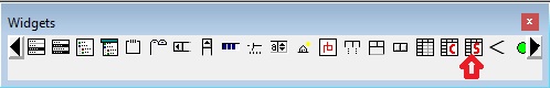
The spreadsheet widget, which is a subclass of grid-widget, is intended for entering only numbers, and so its columns use read-from-string as their data-write-converter functions by default. To try out a spreadsheet widget, choose the icon on the widget palette that looks like the grid-widget, except with a red S in its lower-right corner, as pointed to by the red arrow in the illustration. (The one with a C is for a class-grid.)
The spreadsheet also has a footer section by default for the min, max, mean, median, and sum of the values in the body section above, and those statistics will be computed automatically as you change cell values in the body.
By default, cell values that are set either interactively or programmatically will be stored within the grid-widget itself. But in a typical use case, each grid-row will represent a Lisp object (either a standard-object or a structure-object), while each grid-column will represent the values that are stored in a particular slot of those objects. For this case, you could set the data-object property of each row (typically at run time) to the Lisp object that it represents, and set the data-reader property of each column (typically at design time) to the accessor function of the slot whose values are displayed in that column. (Also set the column's data-writer property to the setf of the accessor function if the user should be allowed to change the values.) Then the grid-widget will automatically display the values that already exist in your application data without your code needing to copy the values from their usual home into the grid-widget with functions like (setf cell-value). Your application would only need to call the function invalidate on the grid-widget whenever the grid should show any recently updated values. And it will write values that the user modifies back into your official data for you (if a data-writer function was supplied). This requires a little more initial setup, but may simplify your code after that. For even more custom grids, you could write your own read-cell-value and write-cell-value methods that control how the widget transfers values between itself and your master data. Just some ideas to ponder.
So that's an introduction to specifying a grid-widget completely interactively. If this approach does not suffice, then see the rest of the grid-widget documentation for ways that you can further customize grid widgets programmatically, such as with additional sections or arbitrary cell behavior such as drawing your own pictures inside cells and reacting to mouse and keyboard gestures in unique ways and so on.
Copyright (c) 2023, Franz Inc. Lafayette, CA., USA. All rights reserved.
|
Allegro CL version 11.0 | ||||||||